Dimensions: height 91 mm, width 117 mm
Copyright: Rijks Museum: Open Domain
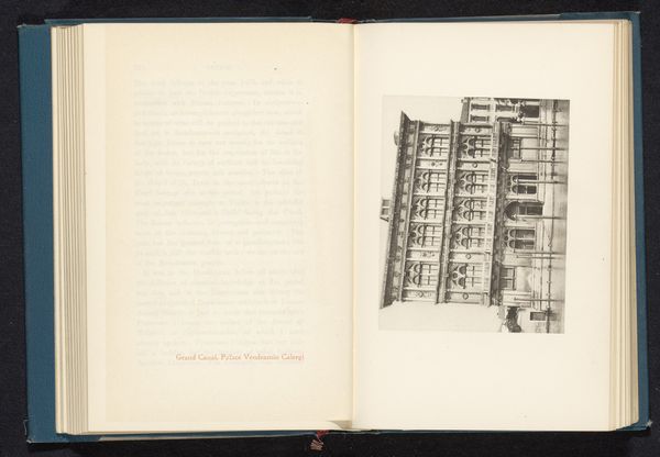
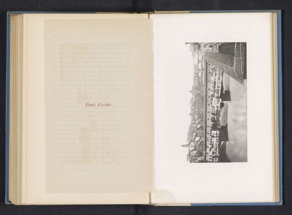
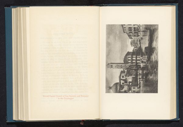
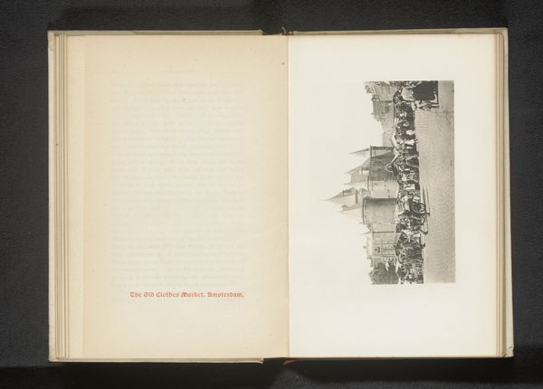
Editor: So, here we have "Exterior of San Marco in Venice," an etching from between 1882 and 1892. The detail is incredible, but it almost feels a little...flat. I'm used to seeing Venice in vibrant colors, so this monochrome version makes me wonder, what exactly are we meant to see here? Curator: Precisely! Forget what you know about Venice in tourist brochures. Consider the line work; the artist meticulously rendered the façade. Observe the rigorous repetition of arches and the stark contrast created by the etching. This isn't about conveying the Venetian light, but instead a careful construction of form and the pure study of architectural components. Do you notice how the perspective lines converge, creating a sense of depth, even within its flatness? Editor: Yes, I see how the lines pull your eye back, despite the limited color palette. It's almost like a mathematical equation rendered artistically. Are we meant to see it more as a study of shapes than a romantic depiction? Curator: Precisely. Strip away the romantic connotations of Venice and focus solely on the inherent visual qualities. The etching technique lends itself to such linear precision, underscoring the building’s underlying geometry. What does the restricted range of the print material do to the perception of space and architectural depth, in your opinion? Editor: It emphasizes the shadows and textures, creating a depth using only value. Okay, I think I see it now, it's not about Venice, but about the elements that define its architecture. Thanks! Curator: Indeed. It reveals the bones, the pure form. Hopefully this close engagement can show how much information there is to decode, and appreciate.
Comments
No comments
Be the first to comment and join the conversation on the ultimate creative platform.
More like this