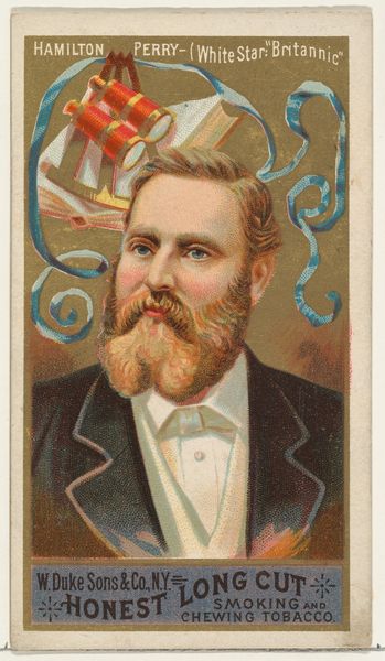
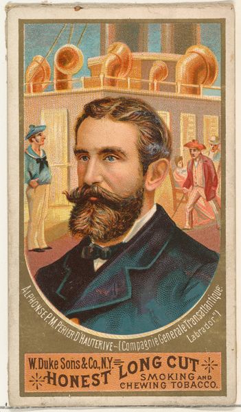
Henry Condron, from the Sea Captains series (N127) issued by Duke Sons & Co. to promote Honest Long Cut Tobacco 1887
0:00
0:00
drawing, graphic-art, print
#
portrait
#
drawing
#
graphic-art
# print
#
caricature
Dimensions: Sheet: 4 3/16 × 2 7/16 in. (10.7 × 6.2 cm)
Copyright: Public Domain
Curator: This print, a promotional card from 1887, depicts Henry Condron of the "City of Chester," part of the "Sea Captains series" by W. Duke, Sons & Co., used to market their "Honest Long Cut" tobacco. I immediately find the caricature both charming and evocative of a certain era. Editor: I'm struck by the composition. The central portrait, framed by a simple circular vignette, creates an immediate sense of focus and authority. The colors, however, are a bit muted. Perhaps an intentional choice to align with the period aesthetic? Curator: Likely so, although the vibrant red of the flag is hard to miss, isn’t it? Notice how it positions Condron in relation to a specific maritime enterprise through symbols. Red, historically a sign of authority or wealth, further alludes to Condron’s status and is also used prominently on the man’s rosy cheeks. The name “Inman,” presumably the shipping line, also sits along the banner with an unknown “I & I”. Editor: The use of that vivid red is intriguing, especially juxtaposed with the somewhat desaturated background. And your point about maritime symbols raises an important structural point. It creates a clear hierarchy of visual information, doesn’t it? First, we see the man, then the signifiers of his profession and the overall brand. The eye moves quite deliberately from figure to context to commodity. Curator: Precisely! Tobacco cards of this type not only memorialized figures of maritime power but also, maybe subconsciously, celebrated an almost mythical masculinity associated with the sea—a cultural force intertwined with global trade and the distribution of commodities, including tobacco itself. There’s continuity here linking image and the tobacco that this print sought to sell. Editor: Absolutely, but what is also being displayed here is advertising for tobacco products that, even in this format, present very precise graphic-art elements meant to attract potential customers: the colors, shapes, balance of foreground/background and also, as you say, the personification of the rugged ship captain that is now directly connected to, even validated, by his association with smoking and chewing “Honest” Long Cut. Curator: Food for thought, indeed, the artwork invites us to delve deeper into the history of advertising and visual culture and what that means for commerce, both then and now. Editor: A fitting example of the enduring dialogue between art, commerce, and cultural perception.
Comments
No comments
Be the first to comment and join the conversation on the ultimate creative platform.
More like this