drawing, paper, sculpture, pencil
#
portrait
#
pencil drawn
#
drawing
#
neoclacissism
#
statue
#
toned paper
#
light pencil work
#
pencil sketch
#
paper
#
sculpture
#
pencil
#
pencil work
#
history-painting
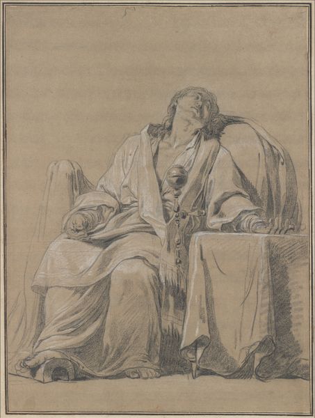
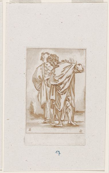
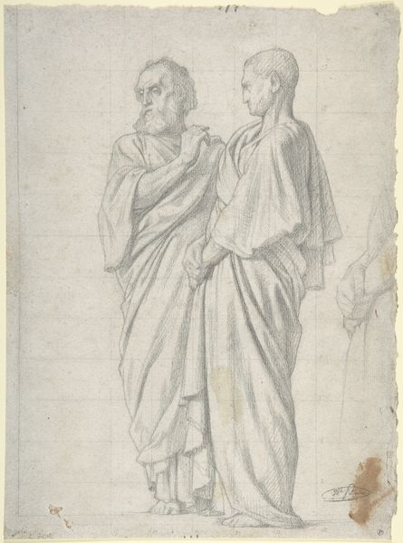
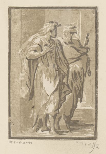
Dimensions: height 288 mm, width 217 mm
Copyright: Rijks Museum: Open Domain
Curator: Here we have Ludwig Pietsch's 1855 pencil drawing, "Entwurf voor een Schiller-Goethe standbeeld," a design for a Schiller-Goethe statue here at the Rijksmuseum. What's your first take? Editor: Well, it definitely feels rooted in a very classical sensibility. Look at the drapery—so reminiscent of ancient Roman sculptures. And there's a quiet dignity to it all, like these are figures meant for reverence. Curator: Absolutely. Pietsch was working within a strong Neoclassical tradition. You can really see it in the emphasis on idealized forms, balanced composition and these restrained emotions, though I wonder if it fully captures their wild sides! These guys were hardly shrinking violets. Editor: You're right, there's an interesting tension there. On one hand, they’re rendered with a very clean, almost academic precision, especially regarding the folds in their robes and classical sandals. On the other hand, the medium itself – pencil on paper – lends an immediacy. You get the sense of a quick study, an artist working out ideas. Curator: It is light pencil work and toned paper, though a history painting, indeed. Also, notice how they're posed. Goethe places his hand on Schiller's shoulder. What do you think is conveyed in their interconnectedness? Editor: It suggests a meeting of minds, a shared vision, maybe even a passing of the torch, poetically. Putting aside artistic flair, that shared moment hints to their connection and respective legacies. Is that Schiller holding a laurel wreath? A symbol of literary glory of days ahead? Curator: Quite possibly! You know, I find this rendering so appealing because of the visible pencil work. It's less about a flawless monument, and more about a human trying to grasp the essence of greatness. Editor: And that essence, however fleeting or perfect, is captured in such careful and delightful line work. All the variations give it a pulse; there is rhythm in the balance and the weight it seems, and doesn’t, carry. Curator: Very nicely put, that gives one much to think about!
Comments
No comments
Be the first to comment and join the conversation on the ultimate creative platform.
More like this