#
aged paper
#
quirky sketch
#
sketch book
#
personal sketchbook
#
coloured pencil
#
sketchbook drawing
#
watercolour illustration
#
storyboard and sketchbook work
#
sketchbook art
#
watercolor
Dimensions: height 197 mm, width 310 mm
Copyright: Rijks Museum: Open Domain
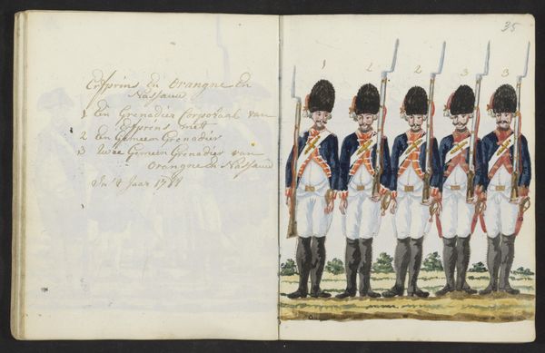
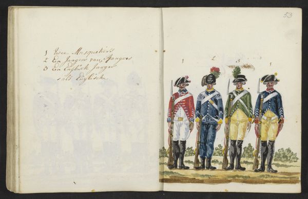
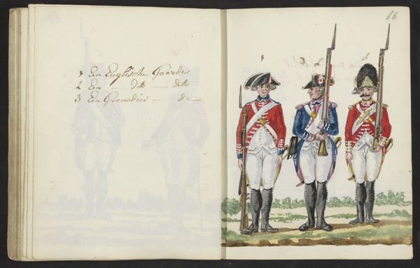
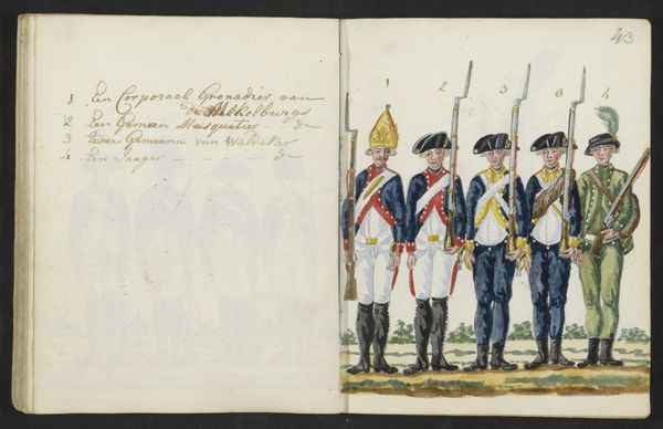
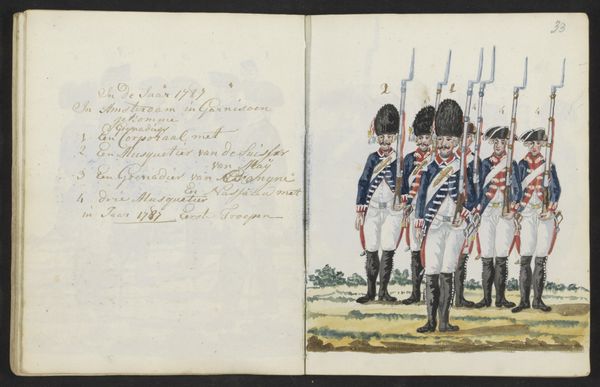
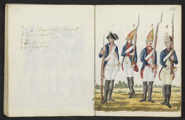
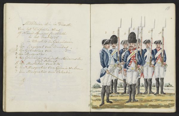
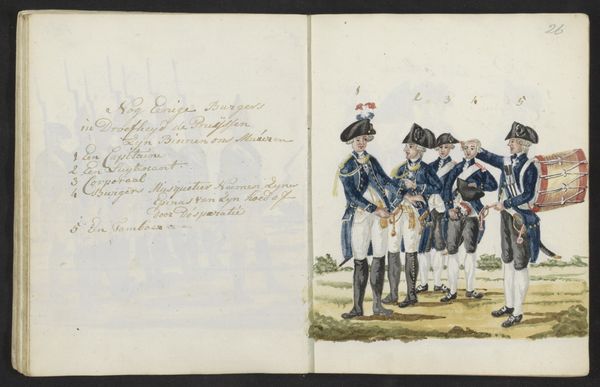
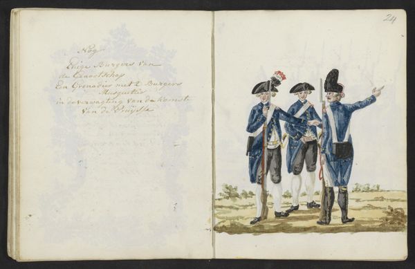
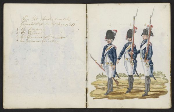
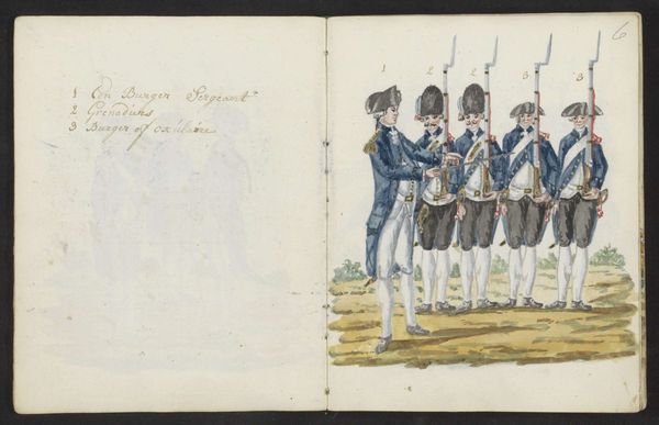
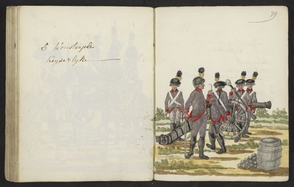
Editor: This is "Uniformen van Engelse grenadiers en musketiers" by S.G. Casten, made between 1795 and 1796, it appears to be watercolor on paper from a sketchbook. The vibrant reds of the uniforms really pop, but the figures themselves seem rather stiff and posed. How do you interpret this work, focusing on its visual elements? Curator: Focusing purely on the formal elements, the artist uses a limited palette, primarily red, white, black, and a muted green-brown. The application of watercolour is flat and illustrative, prioritizing clarity of form over nuanced shading. Notice the repetitive nature of the figures, creating a visual rhythm through their identical stances and spacing. How does this regimented repetition contribute to the overall impact of the piece? Editor: I see your point about the repetition. It gives a sense of order and precision, almost like a catalogue or an instruction manual rather than a dynamic depiction of soldiers. The bright colours feel slightly at odds with the stiffness though. Curator: Precisely. The juxtaposition between the vibrant colour and the rigid forms is critical. The flat application of colour, devoid of texture or depth, further enhances this sense of controlled representation. The lines are precise and deliberate, delineating the uniforms with meticulous detail. Consider how these formal choices might influence our perception of the subject matter. Are we meant to see individual soldiers or archetypal figures of military authority? Editor: That makes a lot of sense! I had been trying to look beyond the obvious military context and I was completely missing how the actual artistic style enhances that feeling of order. Curator: Indeed. And remember, sometimes what is not there—such as dynamism, emotion, or expressive brushwork—speaks as loudly as what is present. It's in the careful arrangement of these absences and presences that the artist constructs meaning.
Comments
No comments
Be the first to comment and join the conversation on the ultimate creative platform.
More like this