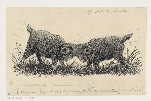
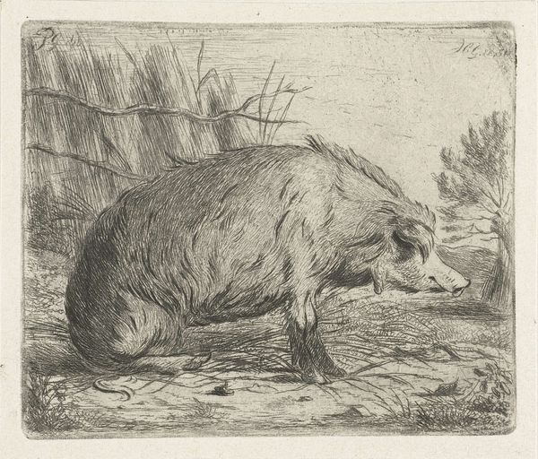
drawing, print, ink, woodcut
#
drawing
#
narrative-art
# print
#
landscape
#
ink
#
woodcut
#
genre-painting
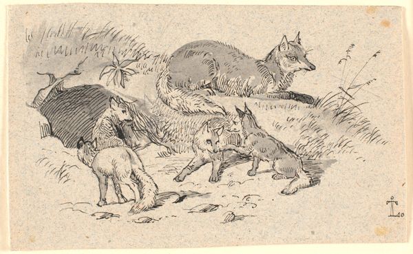
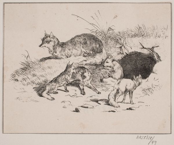
Dimensions: 63 mm (height) x 118 mm (width) (bladmaal)
Editor: This is H.C. Henneberg’s illustration for “Hr. Mikkel,” created in 1858 using ink and woodcut. It gives off a very pastoral, almost sinister vibe to me. The contrast between the details of the fox and the relative simplicity of the ducks creates a compelling tension. What do you see in this piece? Curator: What immediately strikes me is the elegant articulation of line and the sophisticated composition at play. Consider the way Henneberg contrasts textures – the meticulously rendered fur of the fox against the feathery plumes of grass. Observe how he has employed a limited palette to evoke depth and atmosphere. The positioning of the fox is dynamic, creating implied movement to the piece as a whole. Do you notice how the use of a shallow depth of field compresses the foreground and background? Editor: Yes, the flatness almost abstracts the setting. So you are saying it's about the formal relationships instead of the content? Curator: Precisely. While a narrative is implied through the depiction of the fox and fowl, it is the arrangement of forms and textures that truly engages the eye. This orchestration invites a close reading of the printmaking skill on display and establishes an aesthetic relationship between form and representation. Editor: I see what you mean. So by focusing on the formal qualities, we shift the emphasis from storytelling to a study of the visual language itself? Curator: Indeed! A semiotic reading exposes an artful contrast that brings the essence of its aesthetic presence. Editor: I learned that this lens on artworks shifts the focus on intrinsic features and its technical structure! Curator: And the structure, materiality, and composition are very engaging. It all begins with focused observations!
Comments
No comments
Be the first to comment and join the conversation on the ultimate creative platform.
More like this