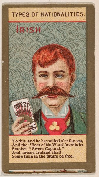
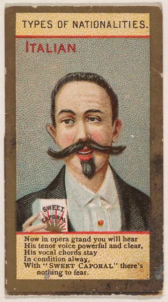
German, from Types of Nationalities (N240) issued by Kinney Bros. 1890
Dimensions: Sheet (Folded): 2 11/16 × 1 7/16 in. (6.8 × 3.7 cm) Sheet (Unfolded): 6 7/8 × 1 7/16 in. (17.4 × 3.7 cm)
Copyright: Public Domain
Editor: This is a lithograph called "German, from Types of Nationalities" issued by Kinney Bros. around 1890. It's a striking image, almost like a character study. The bright colors are interesting, and I find the juxtaposition of the man and his beer quite amusing. How would you interpret the artistic intent here? Curator: The artist's choices concerning composition reveal much. Observe the balanced asymmetry—the man's face slightly offset, countered by the beer and tobacco product. The formal interplay suggests an emphasis not just on the subject, but also on the commercial elements. The crisp lines defining his features and the text create a structured visual plane. Note how color saturation differs. Editor: The rosy cheeks certainly stand out in contrast to the otherwise muted background! It’s interesting you focus so intently on compositional elements, rather than historical intent or artistic expression. Curator: Indeed. The formal arrangement dictates the reading. The artist has segmented planes to contain separate quanta of meaning. We can explore color contrasts to decode its underlying grammar. Consider how different parts may create tensions by design, subtly shaping meaning and directing our vision to the advertisement itself. Editor: So you're saying the whole is more about the sum of its carefully constructed parts, down to color theory? Curator: Precisely. How these components are formally combined constitutes a syntax to be unpacked for meaning beyond any easily-read intention. It uses portraiture in order to better convey the advertisement's intentions by lending an air of personality, then ultimately to drive a purchase. Editor: I'm beginning to see the emphasis on design and construction now. The artwork itself almost becomes secondary. I guess focusing on those elements provides a richer and fuller analysis. Curator: We are seeing the inherent and intrinsic form by a designed whole. The interplay reveals deeper strata of meaning beyond surface readings of identity.
Comments
No comments
Be the first to comment and join the conversation on the ultimate creative platform.