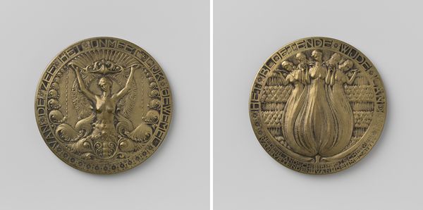
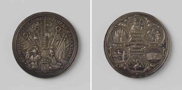
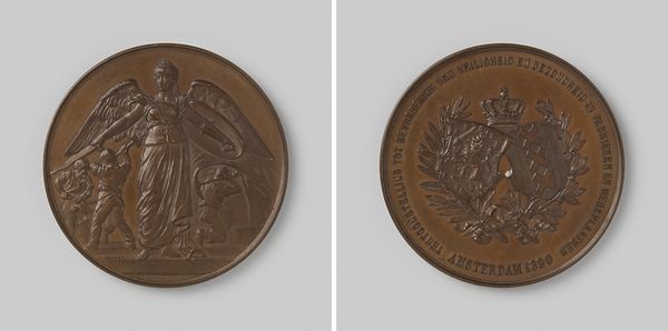
Dimensions: diameter 4.1 cm, weight 27.89 gr
Copyright: Rijks Museum: Open Domain
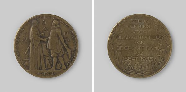
Editor: Here we have the "Nederlandsch Nansencomite," a bronze relief sculpture dating back to 1923, created by Lambertus Zijl. The somber subject matter depicted definitely evokes a feeling of solemnity. I'm particularly struck by the composition, the figures arranged within this circular format. What do you see in this piece? Curator: From a formalist perspective, I am drawn to the interplay of positive and negative space within the composition. Note how the artist uses the circular boundary to create a sense of containment and focus. The tactile quality of the bronze medium adds to the artwork’s emotive power. How does the interplay between the figures and the text contribute to the overall design? Editor: That's an insightful observation regarding the use of space and text. I hadn't considered how the inscription works visually, acting almost like a frame, reinforcing the circular format of the relief. It really locks everything together. Curator: Precisely. Now consider the articulation of the figures. The sculptor employs a skillful use of shallow relief to create depth and dimension. The varied planes capture light and shadow. Do you perceive a specific rhythmic structure in the placement of these figurative and textual elements? Editor: I see that, how the overlapping forms and the texture create depth. And yes, there’s a rhythm in the way the text and images alternate. Curator: This rhythm reinforces the work's symbolic impact. Consider too how the very *thingness* of the metal gives a somber tone. It is, isn't it, as you said at the outset, somewhat sad? What would you say you take away from our exchange? Editor: I'm definitely seeing the impact of its textures now, and how important formal elements are to unlocking meaning. Curator: Indeed. Close visual analysis opens paths to deeper meaning.
Comments
No comments
Be the first to comment and join the conversation on the ultimate creative platform.
More like this