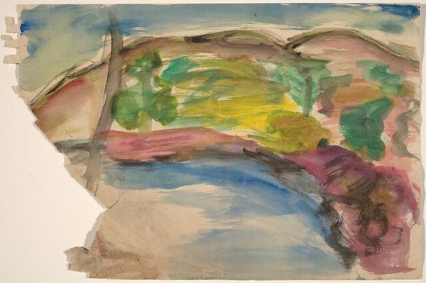
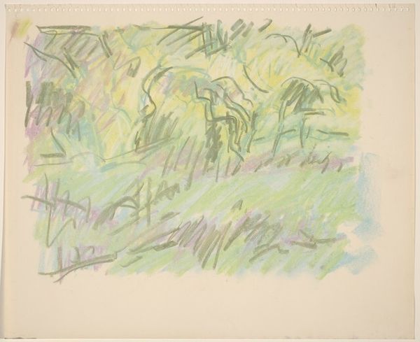
![Landscape [verso] by Mark Rothko](/_next/image?url=https%3A%2F%2Fd2w8kbdekdi1gv.cloudfront.net%2FeyJidWNrZXQiOiAiYXJ0ZXJhLWltYWdlcy1idWNrZXQiLCAia2V5IjogImFydHdvcmtzLzc1NzI1YzlhLTkyMjgtNDc1Ni1iMWVlLTE2ODc3NmIxMWRlZi83NTcyNWM5YS05MjI4LTQ3NTYtYjFlZS0xNjg3NzZiMTFkZWZfZnVsbC5qcGciLCAiZWRpdHMiOiB7InJlc2l6ZSI6IHsid2lkdGgiOiAxOTIwLCAiaGVpZ2h0IjogMTkyMCwgImZpdCI6ICJpbnNpZGUifX19&w=1920&q=75)
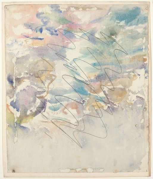
Dimensions: overall: 38.7 x 55.9 cm (15 1/4 x 22 in.)
Copyright: National Gallery of Art: CC0 1.0
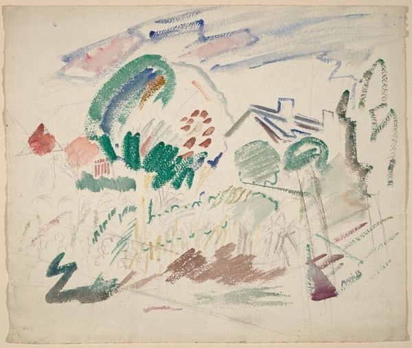
Curator: Before us we have “Landscape [verso],” a watercolor and ink painting attributed to Mark Rothko, circa 1925. It's a striking piece that deviates from his later, better-known abstract expressionist style. Editor: My first impression is that it feels remarkably light and airy. The washes of color—blues, yellows, pinks, greens—create a sense of movement, almost like the landscape is breathing. It feels both immediate and ephemeral. Curator: Indeed. It’s important to consider this work within the context of Rothko's early explorations. As a Jewish immigrant arriving in America in the early 20th century, Rothko grappled with questions of identity and belonging. Early landscapes like this served as explorations of place. The visible mark-making hints at the artist embedding personal emotional geographies within a conventional subject. Editor: I see that. While it certainly alludes to a traditional landscape—perhaps a distant hill, suggestions of trees—Rothko seems less interested in representation and more in the interaction of color and form. There’s a wonderful tension between the representational and the abstract, as though he is trying to deconstruct our expectations of landscape painting. The dripping pigment creates lovely vertical lines, echoing, but not literally replicating, nature's forms. Curator: Right. The lack of a strong focal point challenges conventional landscape painting, echoing his own dislocation and questioning the notion of stable, fixed identities. What narratives were he attempting to disrupt and rewrite at that time in art and society? Was this his method for doing so? Editor: From a purely formal perspective, I am fascinated by his application of the watercolor. See how the translucency of the paint creates layers of visual texture. It seems almost like a dialogue between the artist and the medium itself, an exploration of the inherent qualities of watercolor—its fluidity, its luminosity. Curator: These technical explorations served as foundation for his later color field paintings. He developed a sensitivity to color and form rooted in his specific experience—that's clear. This intimate piece offers a peek into Rothko's complex, developing artistic identity. Editor: Yes, analyzing the push and pull of color, we come away with an even greater understanding of Rothko. Curator: Absolutely. We've highlighted how it sits within historical currents, grappling with identity while prefiguring elements of his mature style.
Comments
No comments
Be the first to comment and join the conversation on the ultimate creative platform.
More like this