Dimensions: support: 293 x 438 mm
Copyright: CC-BY-NC-ND 4.0 DEED, Photo: Tate
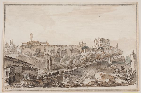
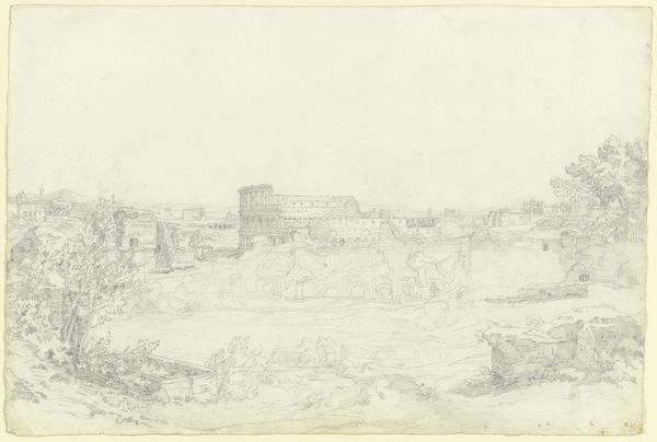
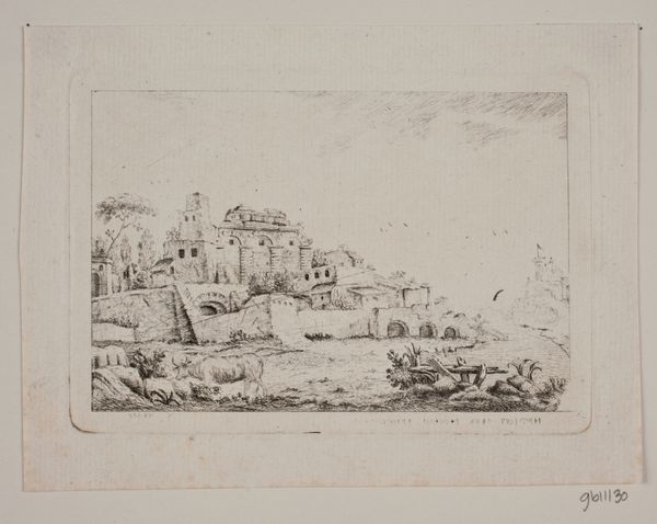
Curator: Richard Junior Cooper's "Italian Composition" presents us with a sepia-toned vista rendered in delicate lines. The oval frame lends it a feeling of looking through a spyglass. Editor: It evokes a sense of faded grandeur; the ruined architecture hints at a bygone era. The washes of sepia create depth, but there is an inherent melancholy. Curator: Indeed. Cooper, working in the late 18th and early 19th centuries, would have been keenly aware of the Grand Tour and the symbolic weight attached to Italian ruins. For many, Italy represented the cradle of Western civilization. Editor: Observe how the composition leads the eye: from the winding path, to the cluster of trees, and upwards toward the buildings perched along the horizon. The perspective reinforces a structured hierarchy. Curator: Consider how the image might have been interpreted by wealthy British patrons of the time, navigating complex social identities back home while engaging with Italy's art and architecture. Editor: And the artist's choice of sepia ink, a medium often associated with preliminary sketches, also gives a sense of immediacy. Curator: It's a potent reminder of how landscapes are rarely neutral territories, but rather stages upon which power, identity, and cultural memory play out. Editor: A fascinating interplay of form and historical context, inviting reflection on the construction of the past through visual representation.
Comments
tate 11 months ago
⋮
http://www.tate.org.uk/art/artworks/cooper-italian-composition-t08827
Join the conversation
Join millions of artists and users on Artera today and experience the ultimate creative platform.
tate 11 months ago
⋮
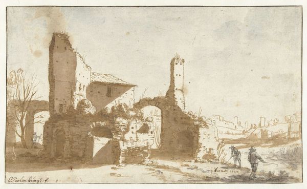
Cooper is known to have drawn with a reed pen, which he has used here with rapid and flowing movements to produce strongly contrasted areas of light and shade. He delights in using quick rounded pen strokes to build up the foliage and shadows. The yellow-brown tone of his broad washes suggest the ink he used was bistre. The washes have been diluted and applied over the iron gall pen work, causing the ink lines underneath to 'bleed'. The sheet is left bare in places to suggest sunlight falling on the scene. Gallery label, August 2004
More like this