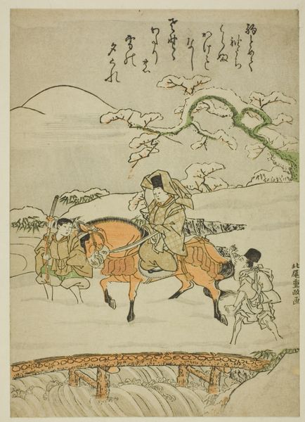
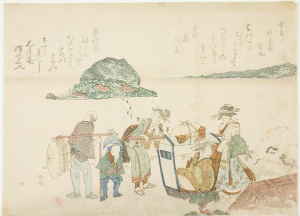
coloured-pencil, print, ink, woodblock-print
#
coloured-pencil
# print
#
asian-art
#
landscape
#
ukiyo-e
#
ink
#
coloured pencil
#
woodblock-print
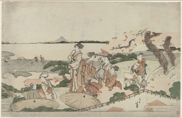
Dimensions: 9 15/16 × 15 in. (25.3 × 38.1 cm) (image, sheet, horizontal ōban)
Copyright: Public Domain
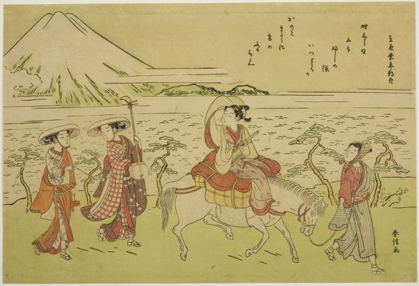
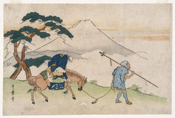
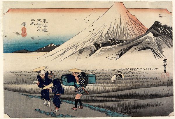
Editor: This is "The Peak of Mount Fuji" by Katsushika Hokusai, dating to the early 19th century, made using ink and color on woodblock print. The whole scene is very gentle, like a memory or a daydream. I'm intrigued by the flat planes and lack of depth. What formal elements stand out to you? Curator: The most immediate feature is the pronounced use of line. Note how the composition is built upon a series of deliberate, calligraphic marks, creating both contour and texture. How does this linearity affect your perception of form? Editor: It almost flattens everything. The figures and the mountain feel like they're existing on the same plane rather than receding into the background. Curator: Precisely. And observe the limited tonal range. Hokusai utilizes a restricted palette of primarily earth tones and muted blues, punctuated by strategic placement of stronger colours such as the red accents. Editor: What effect does this color choice create? Curator: It generates a sense of tranquility. But examine, more specifically, how these limited colors interact. Notice how they emphasize the materiality of the woodblock print and influence the pictorial depth, working in concert with linear perspective to direct our gaze across the entire work. Do you see how he avoids modeling and shading techniques to assert the flatness? Editor: Yes, now that you point it out, I see how Hokusai is making the absence of traditional depth-creation part of the visual language. The print becomes more about surface and line than realism. Thank you, that was very insightful. Curator: Indeed, a stimulating observation! Considering the balance between surface and depth reveals layers of meaning beyond the purely representational.
Comments
No comments
Be the first to comment and join the conversation on the ultimate creative platform.
More like this