Copyright: Rijks Museum: Open Domain
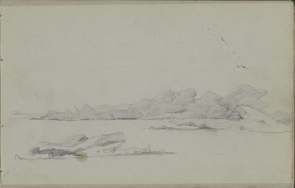
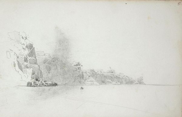
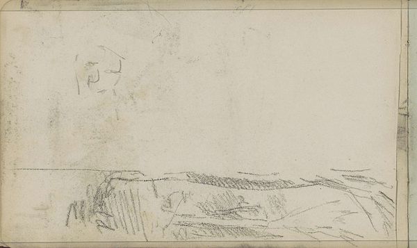
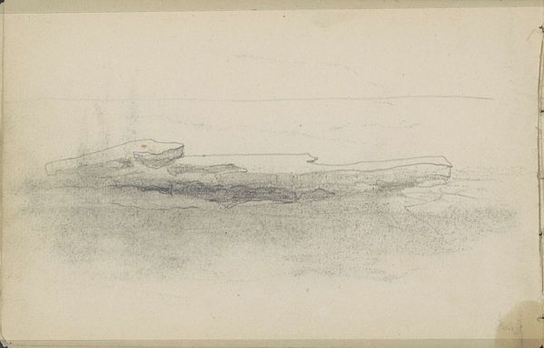
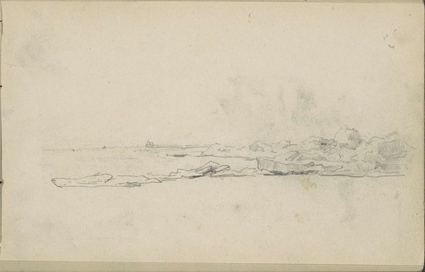
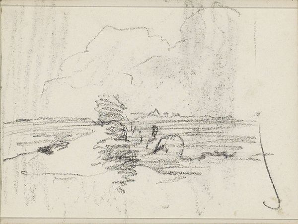
Editor: This pencil drawing is titled "View of the Barents Sea with Icebergs" by Louis Apol, created around 1880. I’m struck by how minimal it is, almost stark. The subtle gradations of the pencil on the paper really convey the icy environment. What are your thoughts, what do you see in this piece? Curator: Indeed. Notice the artist's use of line and tone. The varying pressure of the pencil creates a depth that belies the simple composition. The horizontal orientation reinforces the vastness of the Arctic landscape, doesn't it? Consider also, the interplay between the texture of the paper and the pencil strokes; this lends a tactile quality. It evokes the coldness through purely visual means. Editor: So you're saying it's more about how he uses the pencil, the lines and the gray tone, than the icebergs themselves? Curator: Precisely. The subject matter is merely a vehicle. It's about the formal relationships at play. The subtle gradations are crucial, indicating shifts in plane and volume in the ice formations. Do you perceive how the artist masterfully guides your eye across the otherwise undifferentiated gray ground? Editor: I think so, yes. It is kind of amazing how such a simple sketch can give such a strong feeling. The lack of detail somehow makes it feel bigger. Curator: And further, that very restraint elevates it, detaching it from simple representation to enter a realm of pure visual form. The sketch almost embodies the idea of sublime nothingness through simple contrasts of light and dark. Editor: That's a helpful way of looking at it. I initially saw a cold landscape but now I appreciate the more abstract qualities, the arrangement of shapes, and how the artist directs the eye using only tonal shifts and lines. Curator: Yes. Art can be viewed as simply the study of form for form's sake.
Comments
No comments
Be the first to comment and join the conversation on the ultimate creative platform.
More like this