drawing, engraving
#
drawing
#
baroque
#
pen illustration
#
pen sketch
#
pencil sketch
#
bird
#
figuration
#
line
#
engraving
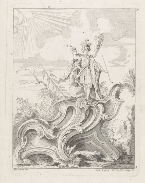
Dimensions: height 245 mm, width 183 mm
Copyright: Rijks Museum: Open Domain
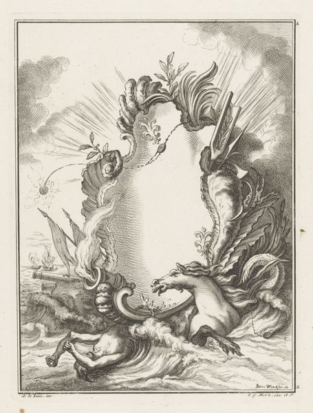
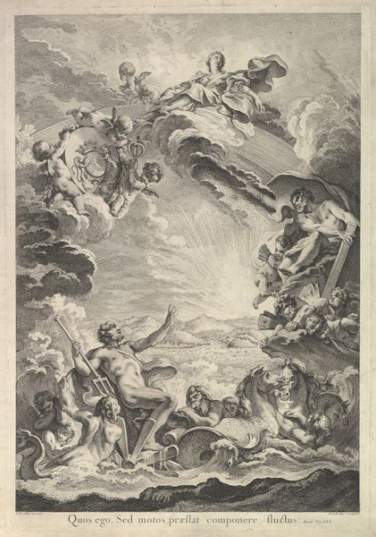
Curator: Welcome! Today, we're looking at Benedikt Winkler's "Cartouche met man met zwaard en vogel," an engraving created sometime between 1750 and 1762. It’s part of the Rijksmuseum's collection. Editor: My first impression is one of dynamic energy. The composition, despite being monochromatic, feels incredibly busy with interwoven lines and competing focal points. There’s almost a sense of contained chaos. Curator: That's a very astute observation. The Baroque style, particularly in decorative arts, often aimed for this effect. Notice how the central cartouche is framed by symbolic elements reflecting power and status. We see classical armour discarded amidst what appears to be a torrent of water. The piece clearly communicates the narrative around the elites in that era. Editor: Precisely. The man wielding a sword certainly commands attention, elevated above the cartouche with an ethereal burst behind him. I see a parallel between his dominance and the watchful bird poised on the right side, its wing adding to that sense of motion you mentioned. They visually bracket and animate what might otherwise be a static emblem. I'm also drawn to the line work itself. It has incredible texture and contrast. Curator: Absolutely, the placement of that particular sword, given the historical backdrop of frequent battles and constant vying for resources and position, underscores its place in that historical era. How do you view that use of iconography within this framework? Editor: It almost reads like a deconstructed crest. The symbols are there - the bird representing nobility, the military paraphernalia evoking conquest and defense, but it's all slightly…unstable, wouldn't you agree? Everything flows. Nothing sits still, perhaps reflecting a transition from previous periods of stability to future eras of perceived upheaval and challenge. Curator: Indeed, these cartouches often appeared on official documents. Their design aimed to reassure patrons with symbols that alluded to control in periods where such certainty seemed elusive. By commissioning artworks displaying certain attributes and cultural themes, they would have had great opportunity to assert their authority. Editor: Very interesting. So it's both an affirmation of power and perhaps a subconscious admission of its fragility? Curator: You've captured the essence, I believe. Baroque art, with its ornamentation and theatricality, often reveals the tensions beneath the surface of society. It allows us to see those layers of ambiguity present in both the patrons' and the artist’s environment. Editor: It's fascinating how what initially appears as decorative bravado actually carries these layered, potentially conflicted meanings. I appreciate that dual perspective. Curator: As do I. Thank you for your contribution. I find the intersection of form and context reveals new aspects of the artwork.
Comments
No comments
Be the first to comment and join the conversation on the ultimate creative platform.
More like this