drawing, paper, graphite
#
drawing
#
paper
#
abstraction
#
graphite
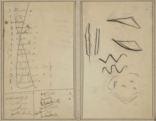
Copyright: Rijks Museum: Open Domain
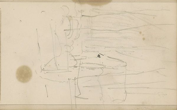
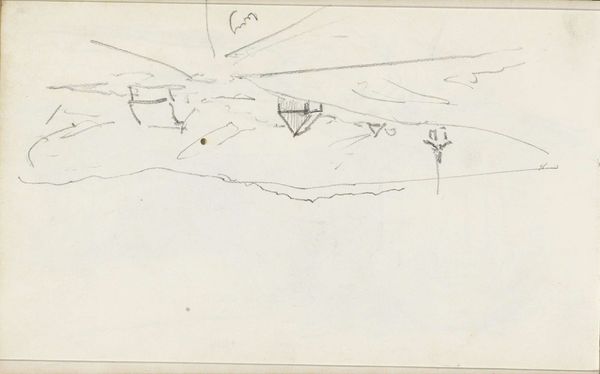
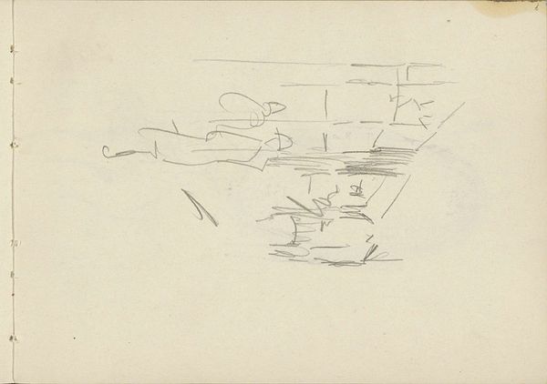
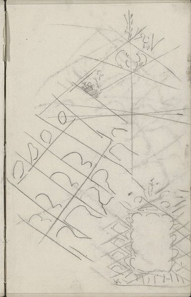
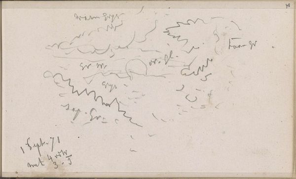
Editor: Here we have George Hendrik Breitner's "Studieblad," created in 1873 using graphite on paper and residing at the Rijksmuseum. Looking at this abstract drawing, I’m immediately struck by the contrast between the delicate medium and the chaotic energy of the lines. What do you see in this piece? Curator: It's indeed a fascinating study in line and form. Notice how Breitner utilizes varying densities of graphite to create depth despite the absence of traditional shading. The composition avoids a central focal point, distributing visual weight across the entire surface. Consider how the angular zigzags interact with the smoother, curved lines. What effect do you think this juxtaposition creates? Editor: I guess the sharp lines feel almost jarring compared to the calmer curves. Maybe it reflects a tension, a sort of visual unease. Curator: Precisely. Breitner masterfully plays with visual tension through this interplay of line qualities. Consider also the materiality of the paper itself—its texture and slight imperfections interact with the graphite, adding another layer of complexity. There's a rawness, an immediacy, in the artist's touch. Do you see how that rawness affects the viewing experience? Editor: Absolutely. It feels very intimate, like glimpsing directly into the artist’s thought process. It moves away from portraying an object toward showing only abstract concepts of lines and forms on a surface. Curator: Indeed. By isolating these fundamental visual elements, Breitner encourages a direct engagement with the aesthetic qualities of the work, divorced from representational concerns. Editor: It’s interesting to think about how simplifying form can be just as expressive as complex depictions. Thank you! Curator: A rewarding insight, well observed. This careful approach yields surprising aesthetic benefits.
Comments
No comments
Be the first to comment and join the conversation on the ultimate creative platform.
More like this