About this artwork
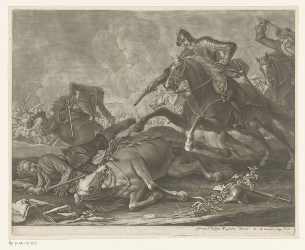
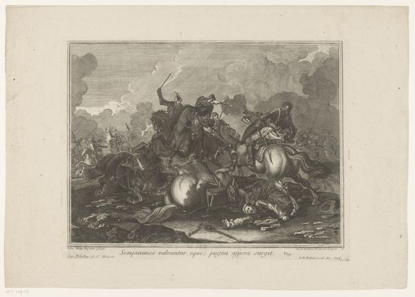
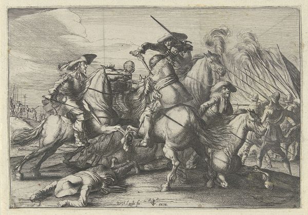
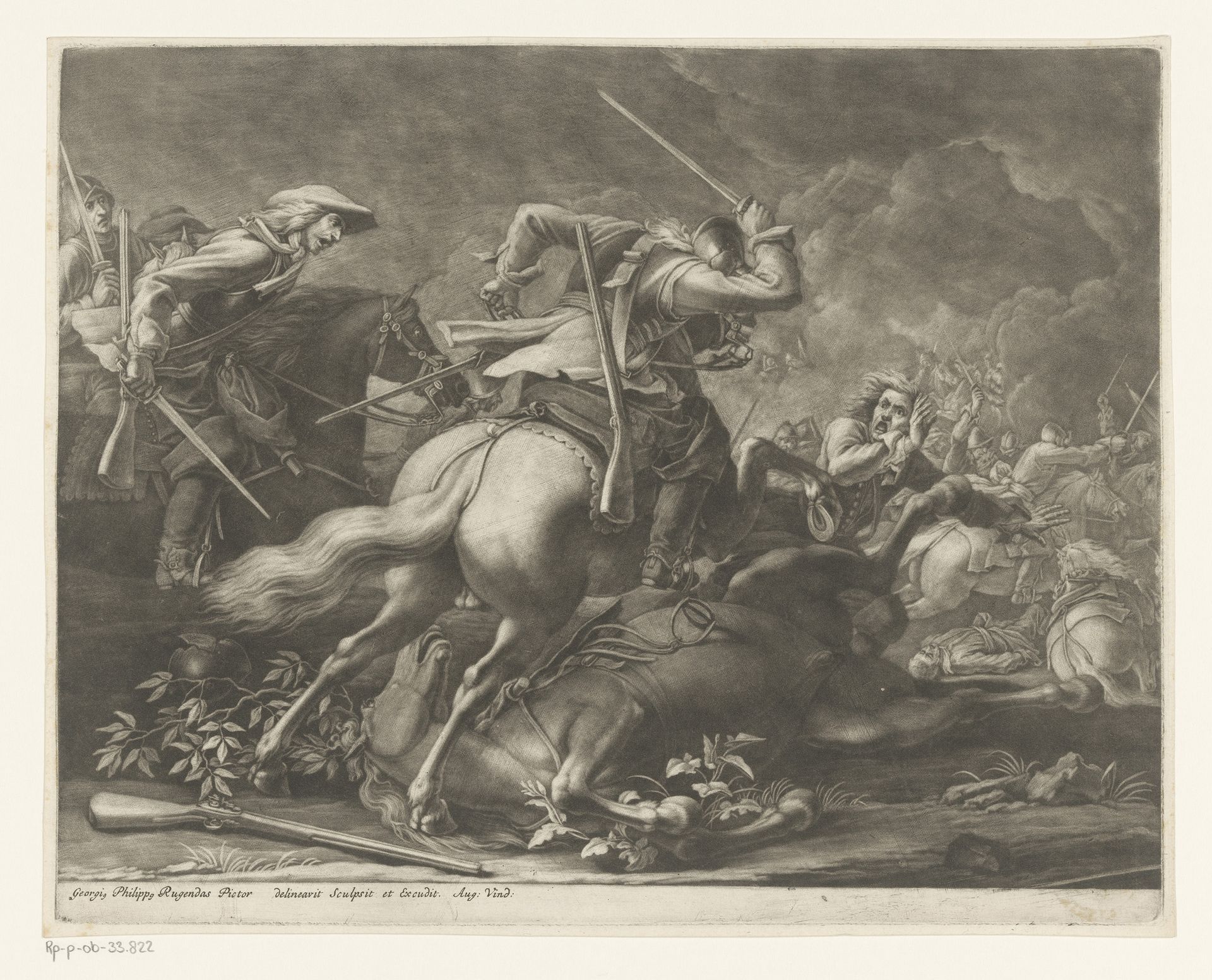
Editor: We're looking at "Ruitergevecht" (Cavalry Fight) by Georg Philipp Rugendas, made sometime between 1676 and 1742. It’s an engraving currently held at the Rijksmuseum. My first impression is of the dynamism; you can almost feel the chaos of the battle. What compositional elements stand out to you in this work? Curator: The artist’s handling of line is quite masterful. Notice how the dense, swirling lines in the background create a sense of depth and disorder, contrasting with the more defined lines that articulate the figures in the foreground. What does this contrast suggest to you? Editor: I think it amplifies the focal point, directing my attention immediately to the clash of figures on horseback. It feels as though the lines themselves are contributing to the narrative, drawing us into the intensity. Curator: Precisely. And consider the use of light and shadow. Rugendas uses chiaroscuro effectively. The highlights on the figures accentuate their forms and the movement of their bodies in the midst of conflict. This stark contrast does more than just create a focal point; it heightens the drama and violence. The darker tones, in contrast, establish depth and separation. Can you tell me what visual qualities of the darker tones you find striking? Editor: The way the shadows cling to the underside of the horses and the folds of their garments; that contrast provides weight, volume, and a sense of gravity. And it gives a really striking definition to the subject overall. Curator: Indeed. And if we consider the diagonal composition, running from the lower left to the upper right, it serves to reinforce this impression of dynamic movement, drawing the viewer's eye through the battle scene. Note also how the lines almost vibrate with activity in that sector, and their diminishing presence outside of it. Editor: So, focusing on its intrinsic qualities—the lines, shading and form—reveals how much meaning can be derived from what some might consider simply a historical depiction. I'll certainly never look at linear works quite the same. Curator: Absolutely. It’s about observing how form contributes to and shapes our understanding of the content.
Artwork details
- Medium
- print, engraving
- Dimensions
- height 259 mm, width 326 mm
- Location
- Rijksmuseum
- Copyright
- Rijks Museum: Open Domain
Tags
baroque
landscape
figuration
genre-painting
history-painting
engraving
Comments
No comments
About this artwork
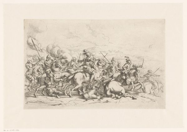
Editor: We're looking at "Ruitergevecht" (Cavalry Fight) by Georg Philipp Rugendas, made sometime between 1676 and 1742. It’s an engraving currently held at the Rijksmuseum. My first impression is of the dynamism; you can almost feel the chaos of the battle. What compositional elements stand out to you in this work? Curator: The artist’s handling of line is quite masterful. Notice how the dense, swirling lines in the background create a sense of depth and disorder, contrasting with the more defined lines that articulate the figures in the foreground. What does this contrast suggest to you? Editor: I think it amplifies the focal point, directing my attention immediately to the clash of figures on horseback. It feels as though the lines themselves are contributing to the narrative, drawing us into the intensity. Curator: Precisely. And consider the use of light and shadow. Rugendas uses chiaroscuro effectively. The highlights on the figures accentuate their forms and the movement of their bodies in the midst of conflict. This stark contrast does more than just create a focal point; it heightens the drama and violence. The darker tones, in contrast, establish depth and separation. Can you tell me what visual qualities of the darker tones you find striking? Editor: The way the shadows cling to the underside of the horses and the folds of their garments; that contrast provides weight, volume, and a sense of gravity. And it gives a really striking definition to the subject overall. Curator: Indeed. And if we consider the diagonal composition, running from the lower left to the upper right, it serves to reinforce this impression of dynamic movement, drawing the viewer's eye through the battle scene. Note also how the lines almost vibrate with activity in that sector, and their diminishing presence outside of it. Editor: So, focusing on its intrinsic qualities—the lines, shading and form—reveals how much meaning can be derived from what some might consider simply a historical depiction. I'll certainly never look at linear works quite the same. Curator: Absolutely. It’s about observing how form contributes to and shapes our understanding of the content.
Comments
No comments