print, engraving
old engraving style
cityscape
genre-painting
engraving
Dimensions: height 341 mm, width 214 mm
Copyright: Rijks Museum: Open Domain
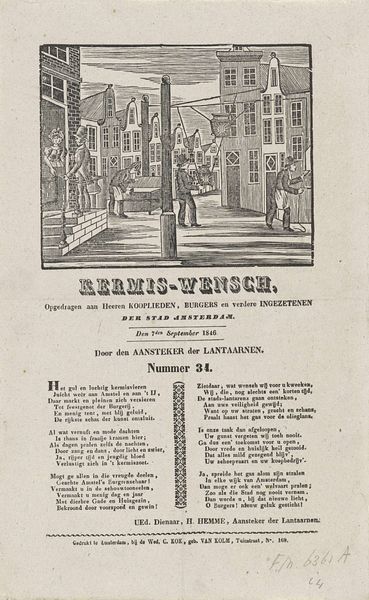
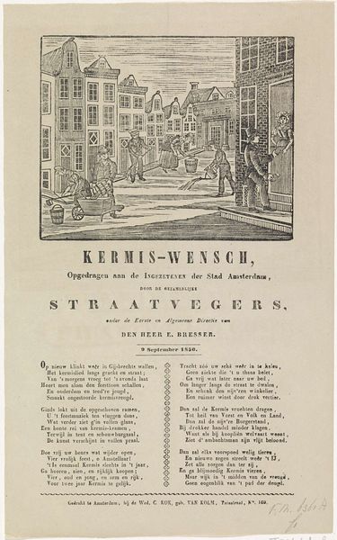
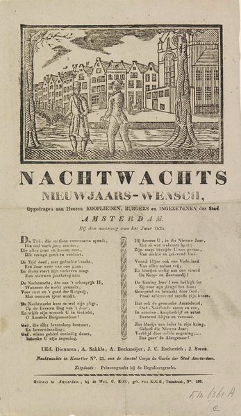
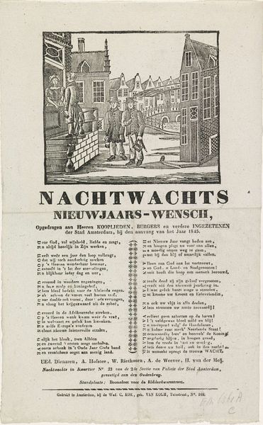
Curator: Today, we’re looking at “Kermisprent van de Amsterdamse Nachtwacht voor het jaar 1846,” or “Fairground Print of the Amsterdam Night Watch for the year 1846,” a print created anonymously in 1846, now held at the Rijksmuseum. Editor: It feels very much of its time. The precise linework creates a rather stiff, formal atmosphere despite the bustling cityscape depicted above the lettering. Curator: Indeed. The medium, an engraving, dictates much of that precision. We have to consider how printmaking functioned. These weren't unique artworks but reproduced images intended for a specific purpose: as advertisements perhaps, or as mementos of the annual fair, the "Kermis." The labor involved and the relatively lower cost would put it squarely within reach of commoners. Editor: While that's undoubtedly relevant, I’m drawn to the composition itself. The upper section is devoted to this detailed scene. I notice the charming buildings lining the canal, a bustling bridge. It’s meticulously rendered and almost compartmentalized from the textual information below. I’m especially taken with the rendering of the windows— the shapes give a sense of depth. Curator: That separation speaks to its function. It’s a marriage of image and text designed to convey a specific message to the Amsterdam citizenry. Note that below the picture, the text is specifically a ‘wish’ from the night watch of Amsterdam for a great kermis (fair). It was assigned to the burghers and residents, and printed by the Widow G. Kolff. Each element – the city view, the greetings of the Night Watch, the names of those officers in print, and finally the location of their Watch and Printer would have local significance and resonance for Amsterdammers. Editor: So, less about the pure aesthetic, and more about the utility and the mechanics of distribution. However, one shouldn’t completely discount its visual merits—the skillful employment of line, the subtle gradations of tone achieve a remarkable level of detail considering the limitations of the medium. Curator: Of course, the craftsmanship is evident, yet it served a distinct social and economic purpose, one of celebration and municipal service within a community. The production process, materials used, and intended audience become crucial to interpreting its true meaning. Editor: I agree. I appreciate learning more about its practical purpose and cultural value, giving context to how the print could function to provide seasonal support to city watchmen in a particular neighborhood. It alters my appreciation for it beyond a mere visual experience.
Comments
No comments
Be the first to comment and join the conversation on the ultimate creative platform.