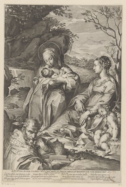
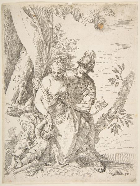
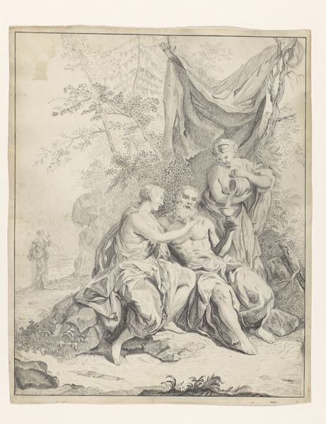
drawing, print, engraving
#
portrait
#
drawing
#
allegory
#
baroque
# print
#
figuration
#
history-painting
#
engraving
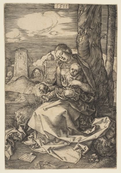
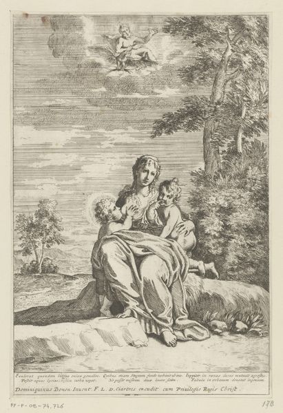
Dimensions: sheet: 8 7/16 x 6 3/8 in. (21.5 x 16.2 cm)
Copyright: Public Domain
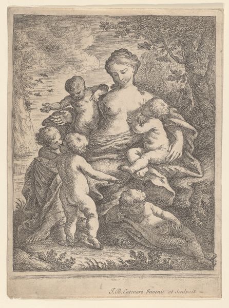
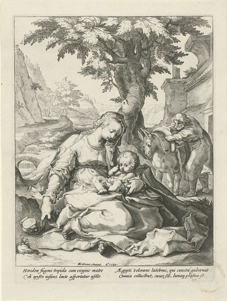
Editor: This engraving is titled "Charity," attributed to the Goltzius School, and was created sometime between 1550 and 1650. It depicts a woman surrounded by children. The mood feels very classical and almost idealized to me. How do you interpret this work, focusing on its form and composition? Curator: What strikes me immediately is the controlled, almost academic handling of the engraved line. Observe how the artist uses hatching and cross-hatching to create tonal variations and to suggest volume and texture. The figure's drapery, for instance, gains its plasticity not so much from naturalistic representation, but from the rigorous application of a specific technique. Note also the almost pyramidal arrangement of the figures, which contributes to a sense of stability and classical harmony. Are you noting this balanced distribution of light and shadow that further accentuates the sculptural quality of the forms? Editor: Yes, the contrast is very sharp. It's not quite naturalistic; there is an idealized form here, and the technique used brings out the textures in interesting ways. Do you think this subtracts from the reading of 'charity' and the general affect? Curator: In a way. By emphasizing the technical virtuosity, the engraving redirects our attention away from a sentimental reading of the theme of charity. We're invited, I would argue, to admire the formal skill of the artist in manipulating line and space. The inscription below, moreover, only furthers this interpretation. What do you observe of the way its lines balance the overall design? Editor: I didn’t really notice, but that is a good point! Its position definitely helps ground the piece and offer a different reading of space and depth. It balances with the figures depicted, rather than simply stating something obvious. Curator: Precisely! The Latin inscription is as much a formal element as it is a carrier of meaning. It enriches the visual organization of the picture as a whole. The careful calibration of visual elements takes precedence over emotional expression. Editor: I never really considered the inscription's place, or the engraving style. Thanks, this changed how I perceive this type of piece.
Comments
No comments
Be the first to comment and join the conversation on the ultimate creative platform.
More like this