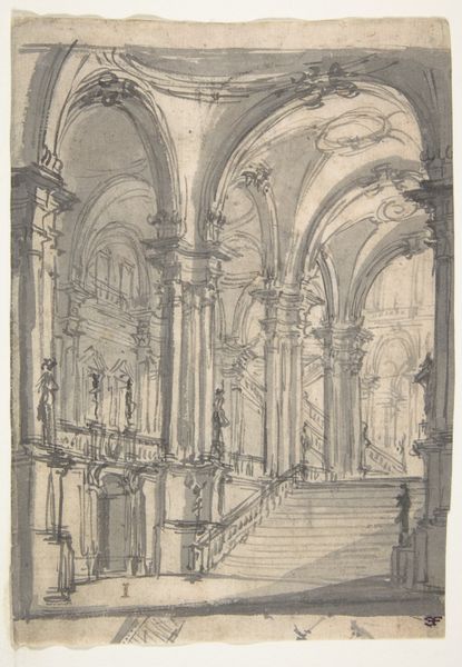
#
aged paper
#
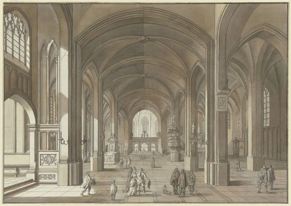
toned paper
#
light pencil work
#
pencil sketch
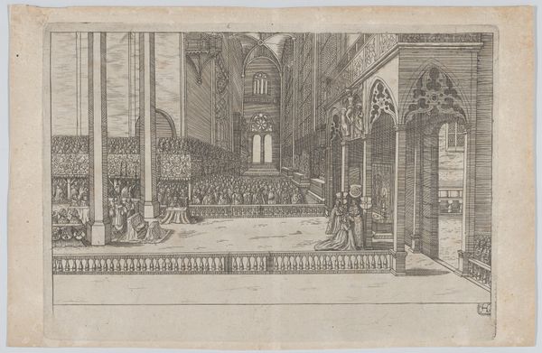
#
old engraving style
#
etching
#
personal sketchbook
#
pen-ink sketch
#
sketchbook drawing
#
storyboard and sketchbook work
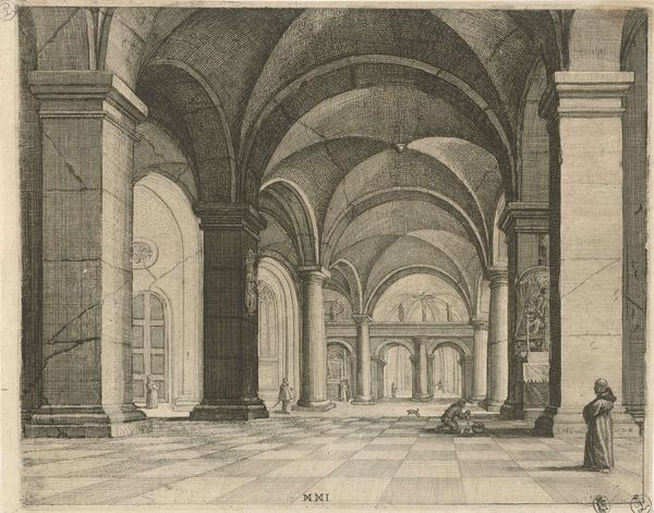
Dimensions: height 190 mm, width 198 mm
Copyright: Rijks Museum: Open Domain
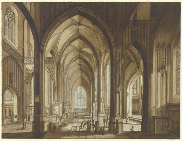
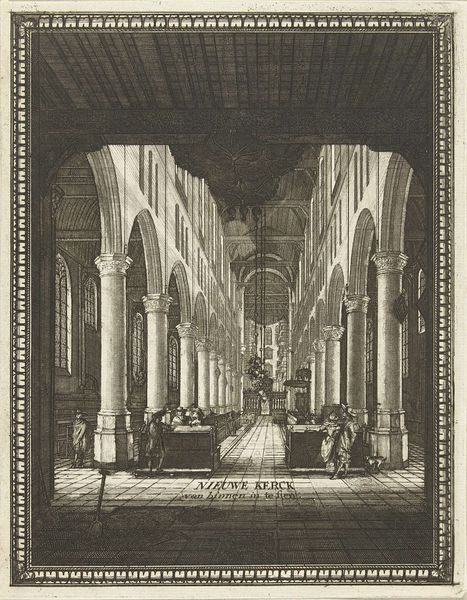
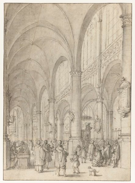
Editor: This is "Interior of the St. Michael's Church in Zwolle" by Jan Gerritsz van Cuylenburg, made in the 17th century, seemingly with pen and ink on toned paper. It feels sparse and emphasizes the sheer volume of the church; what stands out to you the most in terms of composition? Curator: The composition orchestrates a complex interplay of lines and volumes. Consider how the verticality of the columns is subtly offset by the horizontal planes of the pews and floor tiles. Note, too, the strategic placement of the figures which act as points of perspectival convergence but are diminutive relative to the overwhelming architecture, no? Editor: Yes, it definitely shows the massive scale! It’s also interesting how the artist uses light and shadow to define the architectural forms, especially the vaulting. Curator: Precisely. Observe the gradations of tone. They articulate not just the physical space but also imply the ethereal quality of light filtering through the church windows. Do you notice how the details become progressively less defined as the space recedes, creating depth? Editor: I see it now. So, the meticulous rendering of the foreground details gradually dissolves into a more atmospheric treatment of the background. Curator: Yes, this strategic manipulation of focus guides the viewer's eye and accentuates the grandeur and depth of the architectural space. Note the way in which light falls across the various surfaces – how does this influence your reading of the image’s form and structure? Editor: It makes me think about how formal elements like line and tone can create an experience beyond just representation. Thanks! Curator: Indeed. A focused appreciation of the artwork's formal properties truly enables an elevated understanding.
Comments
No comments
Be the first to comment and join the conversation on the ultimate creative platform.
More like this