drawing, print, etching, ink
drawing
aged paper
light pencil work
etching
pencil sketch
old engraving style
landscape
personal sketchbook
ink
ink drawing experimentation
pen-ink sketch
ink colored
sketchbook drawing
cityscape
pencil work
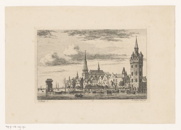
Dimensions: height 104 mm, width 195 mm
Copyright: Rijks Museum: Open Domain
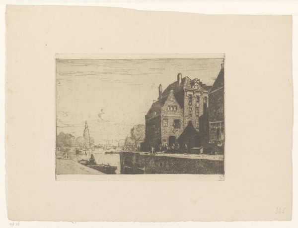
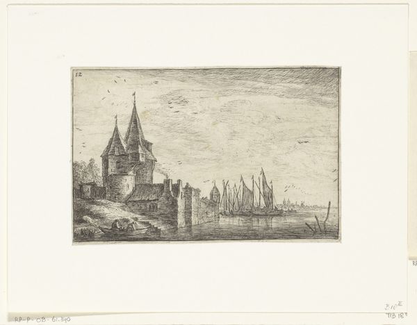
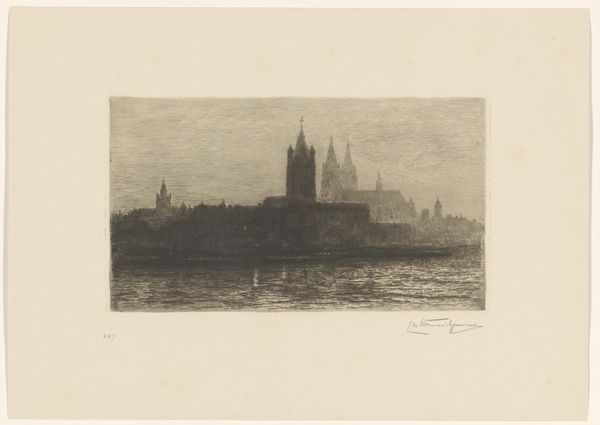
Editor: Here we have Frans Hens' "Het Steen te Antwerpen," likely created between 1866 and 1910. It appears to be an etching, perhaps with some ink and pencil work involved. It's quite delicate, almost ghostly in its depiction. What catches your eye in terms of its composition and technique? Curator: I am particularly interested in the artist's strategic deployment of line. Notice how the density and direction of etched lines sculpt the forms of the Het Steen, creating a clear contrast between the solidity of the structure and the more nebulous sky. Observe also the foreground, rendered with far lighter and sparser strokes, effectively receding into the distance. Editor: That contrast really does emphasize the monumentality of the building. Is there a symbolic dimension to the artist’s decision to depict this particular structure, Het Steen? Curator: While the etching itself might not overtly signal symbolic content, its structural choices contribute meaning. The layering and interlocking components—walls, turrets, rooftops—all create a complex surface. Consider how the distribution of dark and light is itself organized in a system of contrasts and relations, a dynamic interaction through the distribution of these elements in space. The form itself creates symbolic potential. Editor: So, you're less focused on what the building represents historically, and more on how its representation here, through line and form, constructs a meaning? Curator: Precisely. One could say it is an essay on pictorial structure and its impact, achieved through rigorous technique and aesthetic deliberation. What elements in the artwork strike *you* as pivotal in structuring this pictorial logic? Editor: For me, it's how the sharp, defined lines of the building contrast with the almost indistinct horizon line. It’s this very controlled use of technique. I hadn't really considered how much meaning that contrast alone could convey. Curator: Indeed, and I, in turn, appreciate the way you bring historical inquiry into the fold; together, we arrive at a richer appreciation.
Comments
No comments
Be the first to comment and join the conversation on the ultimate creative platform.