print, engraving
#
aged paper
#
toned paper
#
baroque
# print
#
old engraving style
#
sketch book
#
figuration
#
personal sketchbook
#
pen-ink sketch
#
pen and pencil
#
line
#
pen work
#
sketchbook drawing
#
history-painting
#
sketchbook art
#
engraving
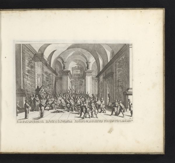
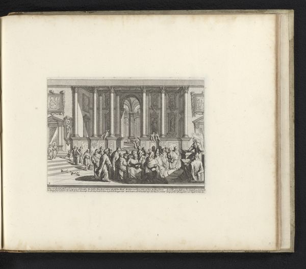
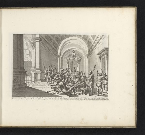
Dimensions: height 171 mm, width 253 mm
Copyright: Rijks Museum: Open Domain
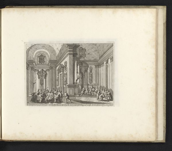
Editor: Here we have Melchior Küsel’s engraving, "Christus voor Kajafas," created sometime between 1670 and 1682. The work, done on toned paper, presents a bustling scene. What catches my eye is how Küsel managed to create such depth and detail using just line and shading. What do you see in this piece, considering its formal qualities? Curator: Considering the engraving’s composition, notice how the artist utilizes linear perspective to draw the eye toward the figure of Christ, subtly positioned at the vanishing point amidst the chaotic gathering. How does the stark contrast between light and shadow affect the overall dynamism? Editor: The sharp contrasts definitely intensify the drama. The areas of deep shadow around the edges seem to contain the frenetic energy concentrated around the central figures. Curator: Precisely. Also, examine the line work. Küsel varies the thickness and density to create areas of visual interest, doesn’t he? What impression do you have of the artist’s handling of texture? Editor: The variation in line weight definitely guides the eye, and although it's a print, it has a surprisingly expressive, almost painterly quality to it. It’s remarkable how a print can convey a sense of Baroque dynamism through form alone. Curator: Yes, and one can also argue that his strategic manipulation of tone allows the print to have what one could call 'depth,' in a very structural sense. Editor: Absolutely, that emphasis on structural composition highlights that the formal choices in this engraving truly dictate the impact and drama of the depicted scene. Thank you, that was very insightful!
Comments
No comments
Be the first to comment and join the conversation on the ultimate creative platform.
More like this