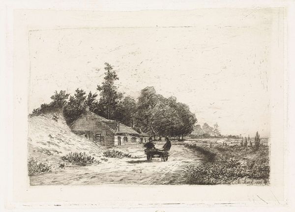
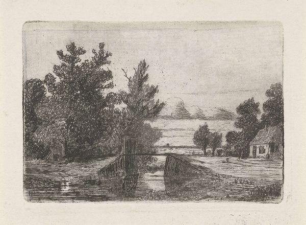
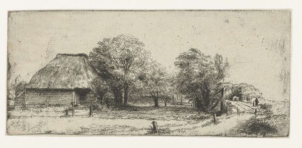
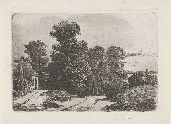
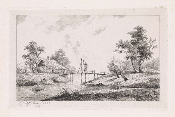
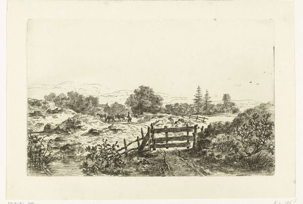
drawing, print, etching
drawing
etching
landscape
etching
genre-painting
realism
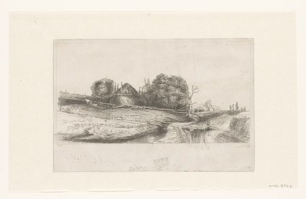
Dimensions: height 125 mm, width 178 mm
Copyright: Rijks Museum: Open Domain
Editor: We’re looking at Elias Stark’s “De Bilt bij Utrecht,” created in 1886. It's an etching and quite small. There's a simplicity to it, a focus on capturing a very ordinary scene. What do you notice about the formal elements of the piece? Curator: The etching technique allows for a remarkable degree of textural variation. Note how Stark uses short, repetitive strokes to define the foliage, contrasting with the smoother tones representing the sky. Observe, too, the artist's use of linear perspective to establish spatial recession; the road and the buildings diminish in scale, guiding the viewer's eye. Have you considered how line weight is employed in this composition? Editor: I see how the heavier lines define the buildings in the foreground, making them more prominent. While the finer lines in the background create a sense of distance. It almost creates a vignette effect. What is the effect? Curator: Precisely. Consider the tonal relationships – the subtle gradations from light to dark. Where does Stark achieve the greatest contrast, and how does this affect the overall balance of the image? Is the composition symmetrical? What feeling do you get from that asymmetry? Editor: I guess I feel like Stark is really observing what’s in front of him with subtle detail. I see it too in the light, how he plays it in different layers from up close and further away to give you that depth. I appreciate how you unpacked it, especially pointing out his use of light and asymmetry. Curator: Yes, the artwork is an excellent study in visual balance achieved through varied textural fields and carefully distributed tones. The power of observation through semiotic analysis helps viewers see this piece better.
Comments
No comments
Be the first to comment and join the conversation on the ultimate creative platform.