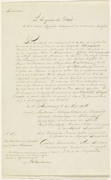
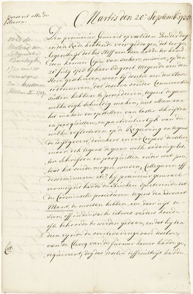
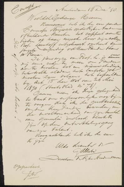
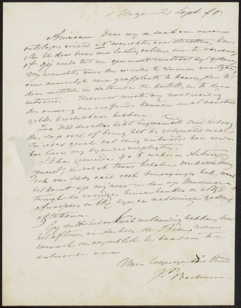
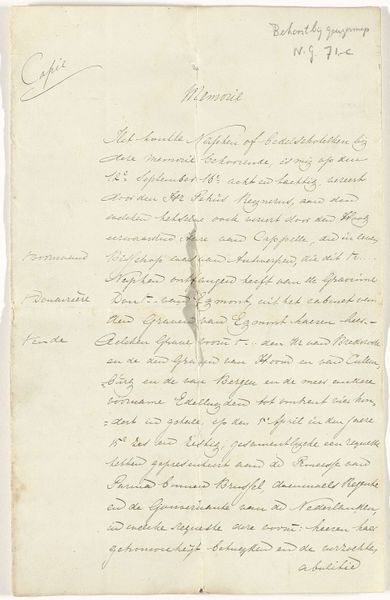
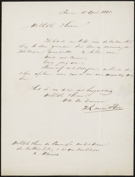
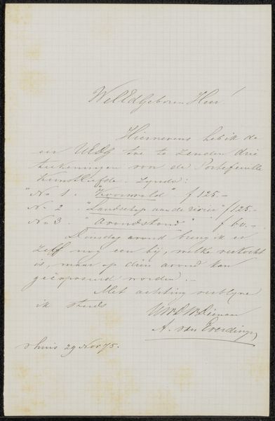
Afschrift van de ordonnantie met een verbod op de drukken en uitgeven van de spotprent op het geldtekort van Spinola, 1624 Possibly 1863 - 1867
0:00
0:00
drawing, paper, ink, pen
#
drawing
#
hand-lettering
#
hand lettering
#
paper
#
ink
#
ink colored
#
pen work
#
pen
#
calligraphy
Dimensions: height 342 mm, width 213 mm
Copyright: Rijks Museum: Open Domain
Curator: Today, we're examining a fascinating drawing attributed to Prosper Cuypers van Veldhoven: "Afschrift van de ordonnantie met een verbod op de drukken en uitgeven van de spotprent op het geldtekort van Spinola, 1624." The inscription, rendered in pen and ink on paper, likely dates from sometime between 1863 and 1867. Editor: My first impression? Intricate and a little daunting! It’s essentially a wall of dense script. The visual impact comes from the unwavering, formal hand; it feels important, official even, due to its calligraphic nature. Curator: Indeed. It's a copy of an ordinance prohibiting the printing and publishing of satirical prints related to Spinola's financial troubles in 1624. What I find compelling is the act of copying itself, the labor invested in preserving such a document. It tells us something about the values of the copier, doesn't it? Editor: Absolutely. The means of reproduction here become crucial. Consider the scribe's deliberate actions, turning print back into the handmade. It begs the question: why preserve this particular text through such laborious means? Was it for personal study, historical record, or something else entirely? The very choice of pen and ink speaks to a desire to imbue the copy with a sense of permanence and gravitas that mere print might lack. Curator: I’m interested in the choice of material—paper, pen and ink were accessible mediums, readily available, but they suggest more than a mere recording device. What type of ink was used? Where did the paper come from? And how do these answers play into how we interpret this restaging of an official pronouncement? Editor: Precisely. And what about the calligraphy itself? It's meticulously executed, yet perhaps not flawlessly so. There’s a tension between the ideal of perfect script and the inevitable imperfections of the human hand, visible in subtle variations of line and spacing. These nuances add a layer of humanness and texture. The form here becomes as crucial as content, transforming historical document into artifact. Curator: I'm particularly drawn to how a utilitarian document has, through skillful execution, become art; reframing labor itself as artmaking. Editor: And I am particularly moved by how an historical document becomes, through careful application of calligraphy, aesthetically interesting, revealing new meanings embedded in its forms.
Comments
No comments
Be the first to comment and join the conversation on the ultimate creative platform.
More like this