Dimensions: height 332 mm, width 236 mm
Copyright: Rijks Museum: Open Domain
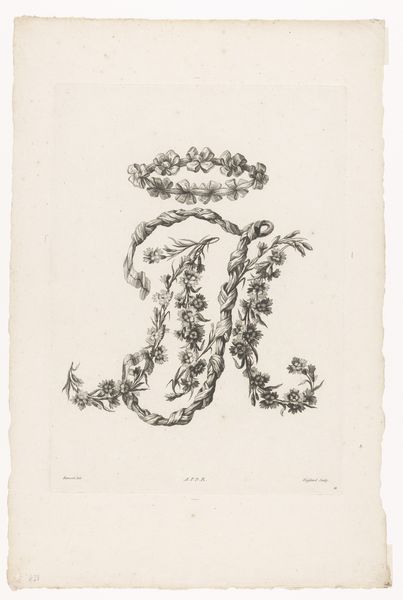
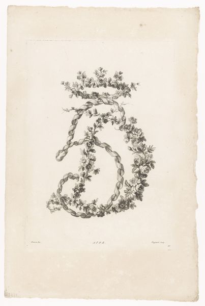
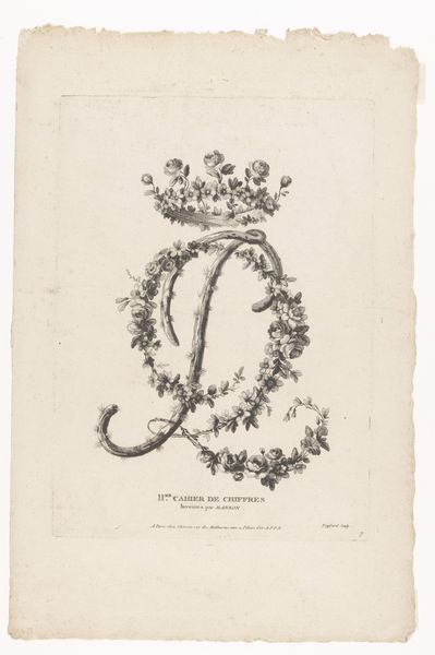
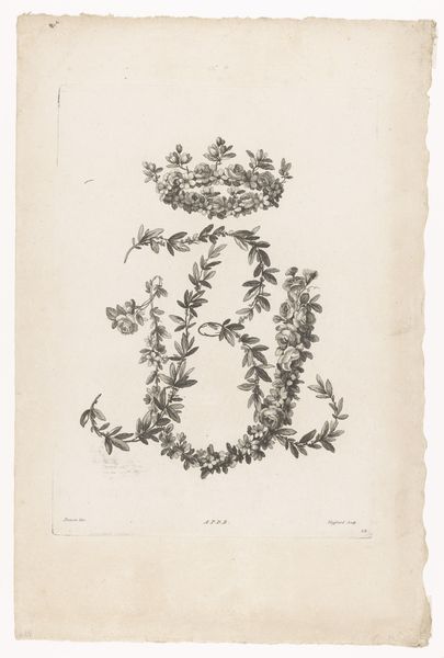
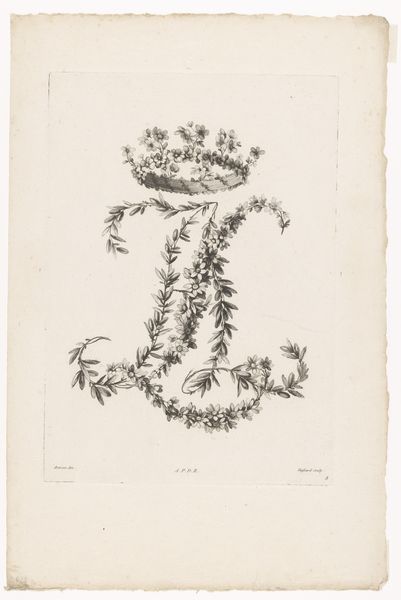
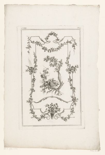
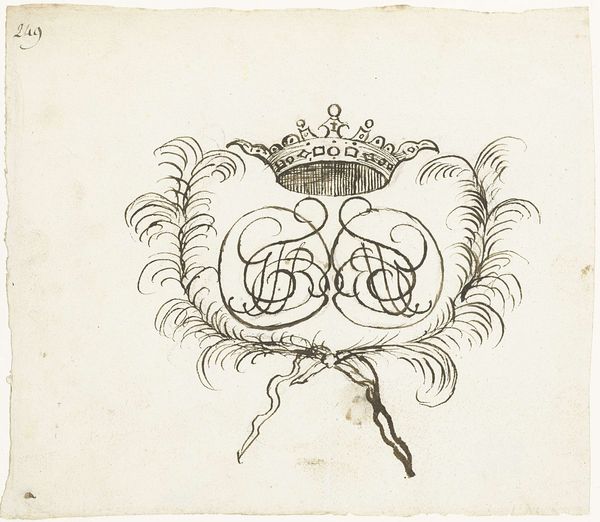
Curator: Here at the Rijksmuseum, we have a striking drawing and engraving entitled "Letters E en C" by Etienne Claude Voysard, created between 1768 and 1786. It depicts precisely what the title suggests: the letters E and C. Editor: My first impression is how delicately ornate this image is. The fine lines and the floral and ribbon embellishments create an elegant yet somewhat formal feel. The geometric rigidity softens with the introduction of organic materials. Curator: Absolutely. Voysard's piece exists in a time of elaborate ornamentation across the arts and decorative objects. You can really see the Baroque influence in the swirls and detailed botanicals rendered in ink on paper. There’s a definite play with form, almost an intellectual exercise in how to marry nature and geometry. Editor: And what does that signify, do you think? This feels like a representation of power—the use of stylized letters could represent the insignia of someone in a position of influence. Considering the date, how would its display signal authority to a public audience? What’s the implicit messaging of floral opulence? Curator: It could have multiple functions: a bookplate, an emblem for stationery, or perhaps a personal statement. Consider also that prints at this time had a particular public role, they helped disseminate not only imagery, but ideas, scientific or aesthetic advancements across the different courts of Europe. Think of the Enlightenment, and the flow of knowledge between scholars. Editor: So, you see this as almost a self-aware statement then, about access to knowledge being entwined with access to privilege? Voysard is very subtly making commentary about class stratification, but is himself also likely participating in it, yes? Curator: That's certainly plausible. Voysard, given the dates and stylistic attributes, was operating in a sphere where the aesthetic was undeniably tied to power. It is a really gorgeous embodiment of the intersection between graphic art and social position during the late 18th Century. Editor: It certainly gives you pause, making one consider all that these flourishes could possibly suggest! Curator: Indeed, and hopefully that deeper awareness informs our modern understanding.
Comments
No comments
Be the first to comment and join the conversation on the ultimate creative platform.
More like this