carving, metal, relief, bronze, sculpture, engraving
#
medieval
#
carving
#
metal
#
relief
#
bronze
#
sculpture
#
carved
#
engraving
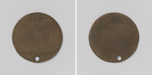
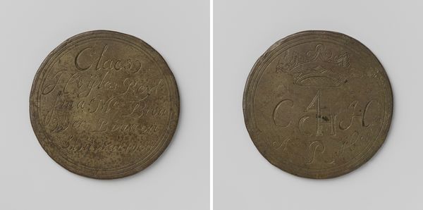
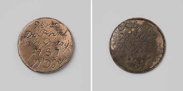
Dimensions: diameter 4 cm, weight 10.34 gr
Copyright: Rijks Museum: Open Domain
Editor: We're looking at a bronze guild badge from 1797, "Kuipersgilde van Utrecht, gildepenning van Johanis Zilver." The patinated surface makes the low-relief details subtle but definite. What strikes me is how a simple hammer shape and carved text create such a direct visual statement. What do you see in this piece? Curator: Focusing purely on form, the dual nature of this medal is striking. We have two faces, each a study in contrasting, yet equally direct, graphic design. Note the rigid geometry of the hammer against the flowing script used for "Johanis Zilver". It's a play between object and language. The circular shape unifies this duality into a contained artistic statement. Does the placement of the date further contribute to the balance, in your view? Editor: I think so. "1797" grounds the script, giving it a sense of place and time, a kind of formal anchor. But, beyond its aesthetic merit, isn't this a rather functional object? How do you reconcile that? Curator: Function does not preclude aesthetic consideration. The success of this piece lies precisely in how its function – to identify a member of the cooper's guild – is inextricably linked to its form. The medium of bronze lends a certain permanence and weight to its symbolic purpose. Ultimately, the formal and the functional cohere perfectly. Editor: I see that now. Looking at it as a formal piece helps understand its function and meaning on another level. Thank you! Curator: My pleasure. Examining its structural elements allows us to look closer and find new appreciation.
Comments
No comments
Be the first to comment and join the conversation on the ultimate creative platform.
More like this