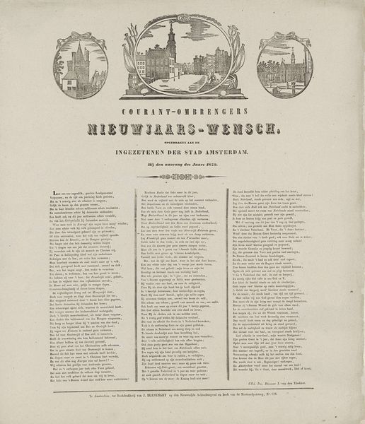
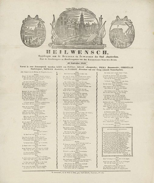
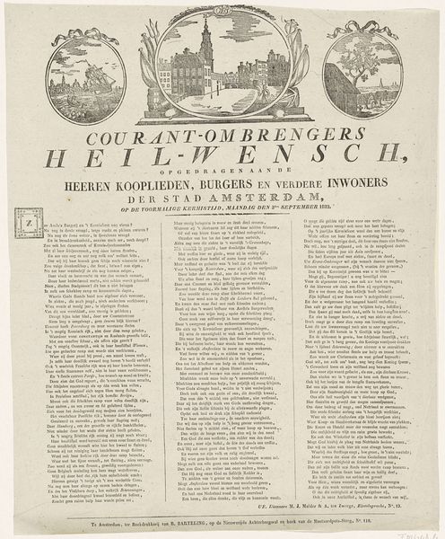
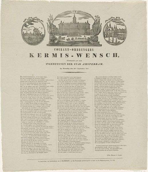
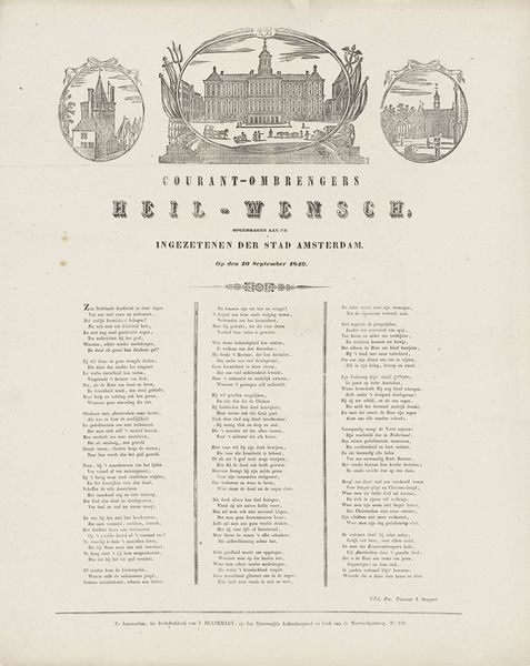
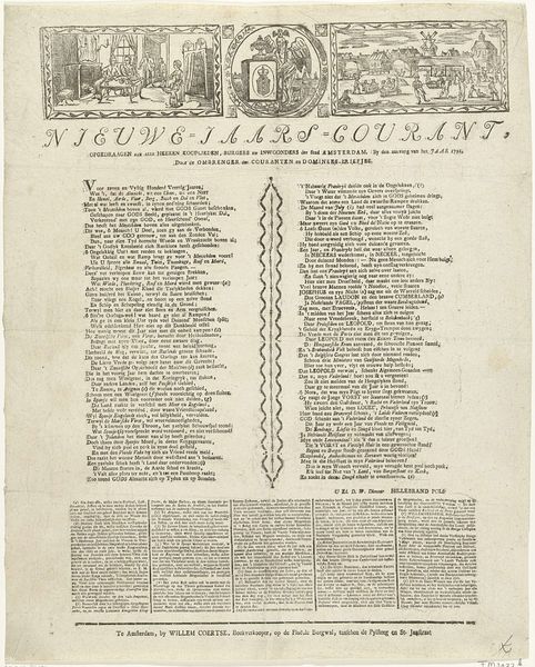
Nieuwjaarswens van de Amsterdamse courantombrengers voor het jaar 1853 1852 - 1853
0:00
0:00
jacobcoldewijn
Rijksmuseum
print, paper, typography, engraving
# print
#
paper
#
typography
#
cityscape
#
history-painting
#
decorative-art
#
engraving
Dimensions: height 577 mm, width 459 mm
Copyright: Rijks Museum: Open Domain
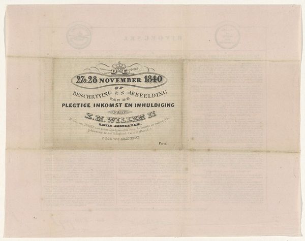
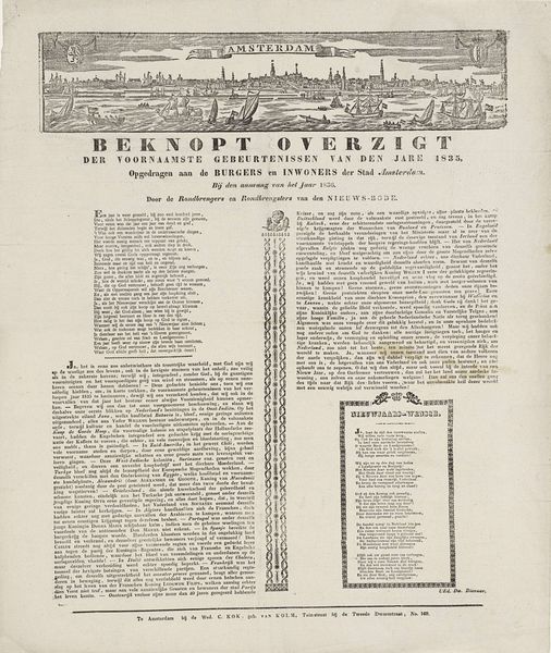
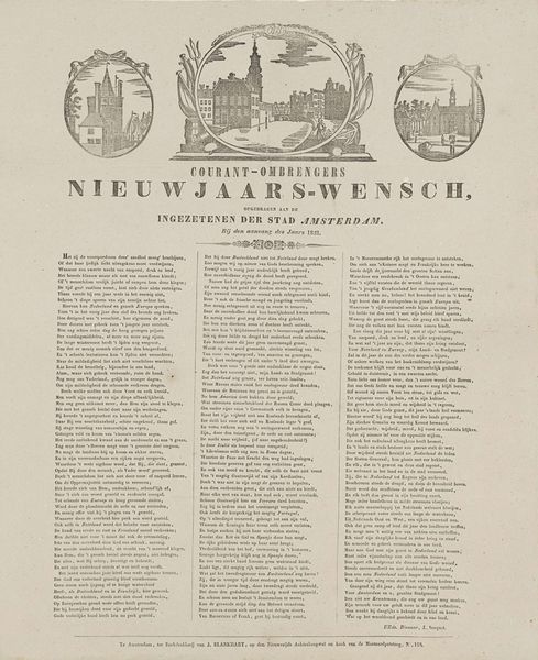
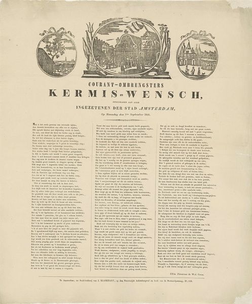
Curator: This piece is entitled "Nieuwjaarswens van de Amsterdamse Courantombrengers voor het jaar 1853," or "New Year's Greetings from the Amsterdam Newspaper Carriers for the year 1853." It's from the years 1852 to 1853, created by Jacob Coldewijn. We see a combination of typography and engravings on paper. Editor: My first thought is how striking the formal structure is. The symmetry, the framing devices, the sheer density of text—it's a very organized and almost overwhelming visual experience. Curator: Absolutely. Contextually, these "nieuwjaarswensen" or New Year's greetings were a common way for tradespeople to solicit a tip or bonus at the start of the year. This particular example uses imagery of Amsterdam itself. The typographical layout emphasizes the formal beauty and sophistication sought after during that period. Editor: Note how the text functions almost like an ornamental pattern, balanced against those crisp cityscape vignettes in the top register. I'm drawn to the interplay of linear forms; how the shapes of the letters relate to the shapes of the buildings. There is such attention to detail. Curator: The imagery is carefully chosen to convey the civic pride and commerce so integral to the social fabric. Consider the choice of vignettes. It highlights significant Amsterdam locations central to municipal life. The typography also uses fonts that communicate formality. Editor: You touched on pride, and it made me realize how idealized these images must have seemed. The print constructs a kind of symbolic Amsterdam; everything presented so clean, legible, rational. The poem certainly also alludes to prosperity in the new year. Curator: It served, on one level, as propaganda – promoting stability and economic growth in the aftermath of political upheavals across Europe. This print then functioned not just as a commercial appeal but also a form of civic promotion. Editor: Thinking about visual structure, this also brings a question of audience to mind. Considering the amount of text and detail in the prints, to whom was this image truly appealing? Someone wealthy and literate, or for general public view? Curator: That's the fascinating contradiction of prints like these. They're inherently public, designed for circulation. Yet, they carry this veneer of high culture. They simultaneously court popular and elite audiences. Editor: Thank you for offering your insights; looking at the piece through these combined perspectives has shifted how I view this artwork. Curator: The beauty here lies in how this single printed sheet illuminates an intersection of aesthetic style and societal expectations that formed a cornerstone of Amsterdam's culture.
Comments
No comments
Be the first to comment and join the conversation on the ultimate creative platform.
More like this