drawing, paper, ink, pen
#
drawing
#
hand-lettering
#
ink paper printed
#
hand drawn type
#
paper
#
personal sketchbook
#
ink
#
hand-drawn typeface
#
ink drawing experimentation
#
pen-ink sketch
#
ink colored
#
sketchbook drawing
#
pen
#
sketchbook art
Copyright: Rijks Museum: Open Domain
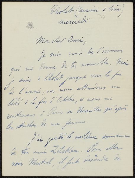
Editor: Here we have Mariette Richard's "Brief aan Philip Zilcken," possibly from 1920, created with ink and pen on paper. The writing itself is the art! What strikes me most is how the delicate lines form both script and image. How would you approach an interpretation of this work? Curator: From a formalist perspective, the texture of the ink on paper establishes a dynamic interplay. Observe the careful construction of each letter, creating a visual rhythm, where positive and negative spaces interact, forming shapes as integral as the words themselves. The color creates tonality as the light bounces off different parts of the sheet. Do you see how the composition balances legibility with expressive mark-making? Editor: Yes, I see that. The density of the script varies across the page, creating a sense of movement. But is there more to it than just the arrangement of shapes? Curator: In Formalism, we can appreciate that what matters are the relational properties within it. Even if we can read a phrase, that's still part of the surface quality. It is difficult for any visual image to exist as an act of communication, devoid of a message. The materiality contributes, wouldn't you say? Editor: The rough texture of the paper does seem important, yes. I guess I was trying to bring in what the message itself could add to it... But sticking to what is in front of me as you describe does let me focus more clearly on those contrasts and densities. Curator: Exactly. By closely attending to the intrinsic elements—line, form, and the balance within the composition—we grasp the artwork's aesthetic essence. Editor: So, in focusing on those things, I am actually seeing a lot more detail! Thank you.
Comments
No comments
Be the first to comment and join the conversation on the ultimate creative platform.
More like this