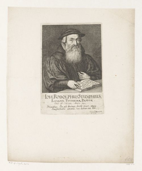
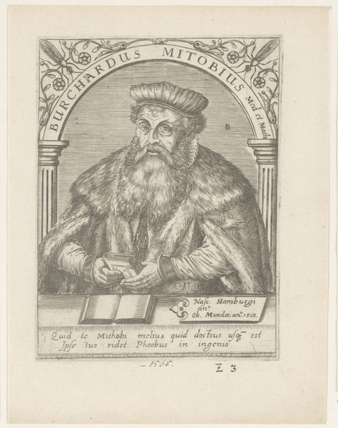
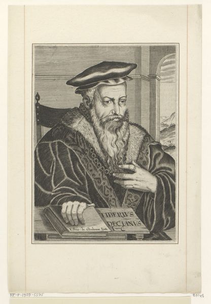
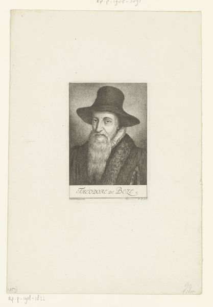
print, engraving
portrait
baroque
old engraving style
engraving
realism
Dimensions: height 248 mm, width 158 mm
Copyright: Rijks Museum: Open Domain
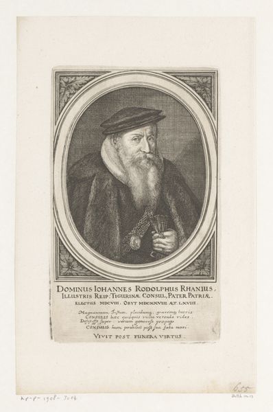
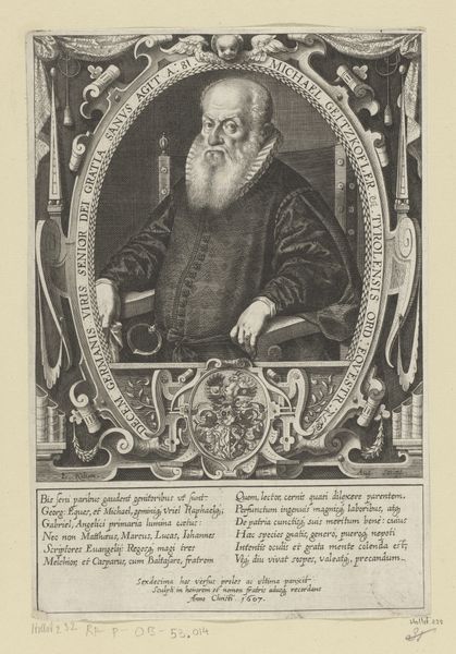
Curator: Before us is a print entitled "Portret van Caspar Thomann" created around 1675 by Conrad Meyer. The artwork currently resides here at the Rijksmuseum. Editor: My first impression is somber. The tight oval frame, the stark contrast between the figure and the background—it feels quite formal, almost austere. The etching itself looks meticulously detailed. Curator: Indeed. Meyer's expertise as a printmaker really shines through, doesn't it? Engravings like this weren’t merely aesthetic objects; they served a crucial role in disseminating images and solidifying reputations across society. Consider the labor invested and how printmaking made portraits accessible, breaking from painted works just for the wealthy. Editor: Absolutely, the labor and material considerations are significant. But I am also struck by Meyer's control over the medium itself. The quality of the lines used is varied, achieving realistic textures within the monochrome format. The layering in the beard and costume give depth. Curator: The baroque styling is obvious, yet there's a distinct realism, don't you agree? He has clearly mastered depicting fabric and human form accurately for the print runs, not just the initial portrait. It’s indicative of both the market pressures of creating portrait prints as well as of Meyer's capabilities within that economic setting. Editor: Quite true. Notice, for example, how Meyer uses light and shadow to create the impression of three-dimensionality. Look at the subtle shading on his face and clothing to suggest the fall of light. The image almost feels sculptural despite being flat. It also strikes me the latin phrase at the bottom hints toward his social role. Curator: Exactly, while Meyer’s mastery over form certainly holds our attention, viewing this work purely in terms of lines and shading, ignores the original intent of its material production and its socio-political relevance in early 18th century Europe. We shouldn't divorce it from those contexts of creation. Editor: You're right; it's a dialogue between form and context, after all. Focusing on production doesn't diminish my appreciation of the refined composition. We can't lose the aesthetic considerations for the role of artwork’s use, because the portrait is a visual and cultural representation. Curator: Precisely. And by thinking about how the materials were deployed and what they achieved within this milieu we come to new understanding of what's depicted beyond the surface. Editor: An illuminating point of view on this captivating piece! Curator: I concur, it provides a much needed consideration that challenges the purely aesthetic appreciation of artwork and helps inform how prints functioned in European culture.
Comments
No comments
Be the first to comment and join the conversation on the ultimate creative platform.