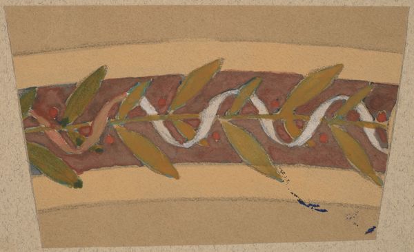
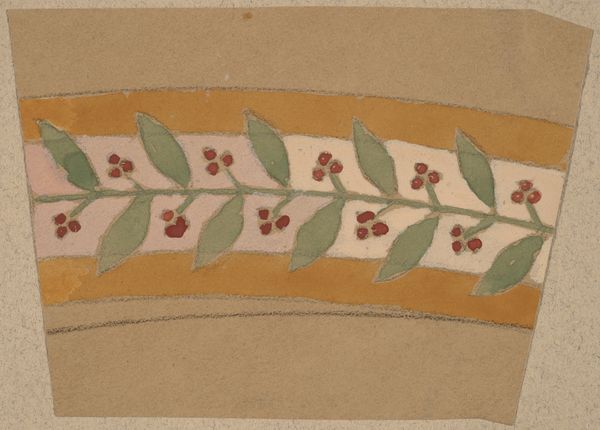
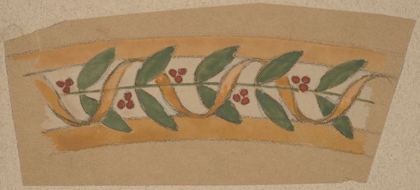
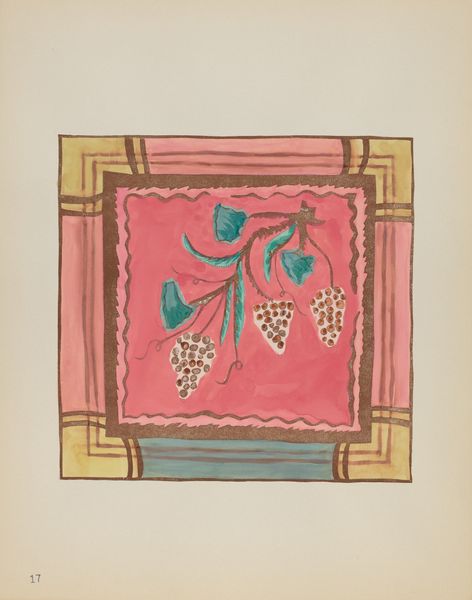
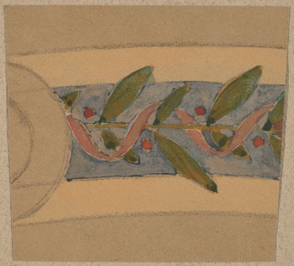
drawing, watercolor
#
drawing
#
arts-&-crafts-movement
#
watercolor
#
geometric
#
decorative-art
Dimensions: sheet (irregular): 5.7 × 5.7 cm (2 1/4 × 2 1/4 in.) mount: 30.2 × 46.3 cm (11 7/8 × 18 1/4 in.)
Copyright: National Gallery of Art: CC0 1.0
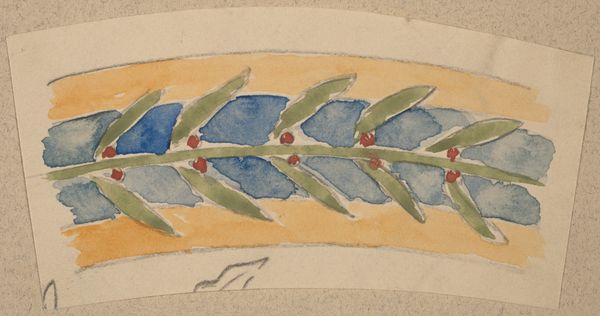
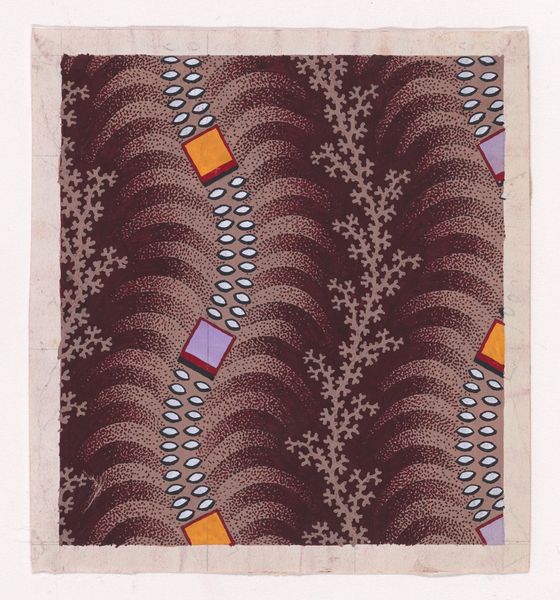
Curator: Charles Sprague Pearce, known for his society portraits, also designed decorative borders, like this study, created between 1890 and 1897, using watercolor and drawing techniques. Editor: There's a restrained elegance to it. The repetition of soft pink leaves and berries against the ochre backdrop creates a comforting sense of order, a visual balm of sorts. Curator: Absolutely, and considering Pearce’s broader oeuvre, it’s fascinating to see him engage with the Arts and Crafts movement, which prioritized craftsmanship and the integration of art into everyday life, quite the contrast from high-society portraiture. Perhaps it offered him a different form of expression, free from the constraints of portraying wealth and status. Editor: I find it interesting that the means of production almost disappears. Pearce softens the process using watercolor to evoke, rather than manufacture, with precise geometric elements. The design doesn’t scream mass production, it whispers of skilled handiwork striving for the essence of nature, which of course runs directly counter to industrial design logic. Curator: That tension between natural inspiration and meticulous construction seems central to the design. The berry motif feels somewhat subversive. At that time women were often associated with, or relegated to, decorative arts, so what statement could the designer be making with its geometry? And why those subdued pinks and yellows? Is there a quiet commentary here on domesticity, gender roles, or the romanticisation of nature that glosses over social inequalities? Editor: Possibly. Or perhaps it reflects a specific client's tastes. The subtle textures achieved with watercolor certainly suggest a luxury product, intended for a wealthy household. Even its functionality takes on a unique dimension when viewed as more than just a pattern, but as an aspirational marker of refined living, an echo of handcrafting. Curator: True, though interpreting intent remains complex. The design itself, stripped of its art historical associations, provides insight into artistic tensions inherent in industrial advancements. Editor: Indeed, a testament to design where beauty lies not just in its aesthetics but also in its quiet dialogue with labour, nature, and social identity.
Comments
No comments
Be the first to comment and join the conversation on the ultimate creative platform.
More like this