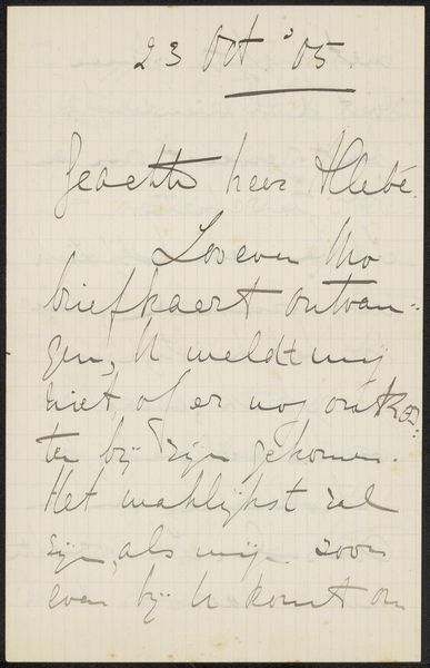
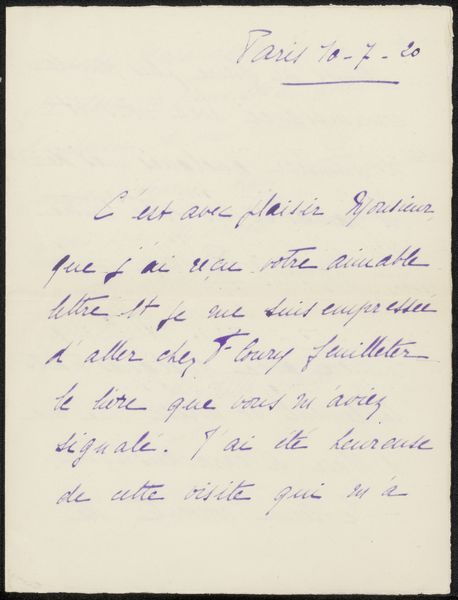
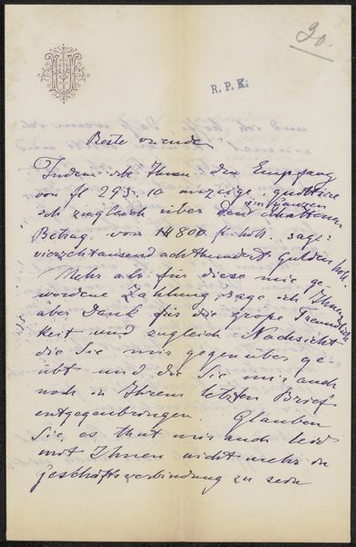
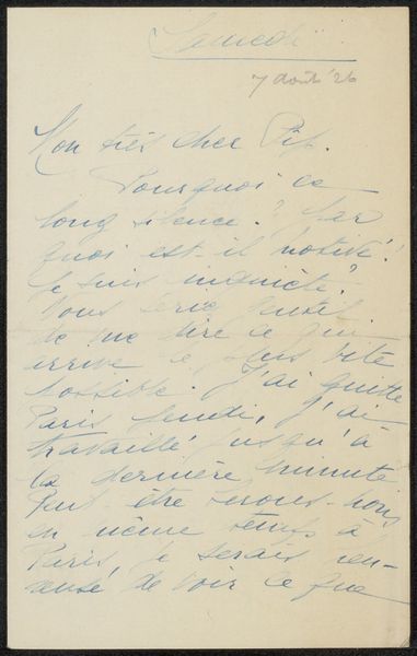
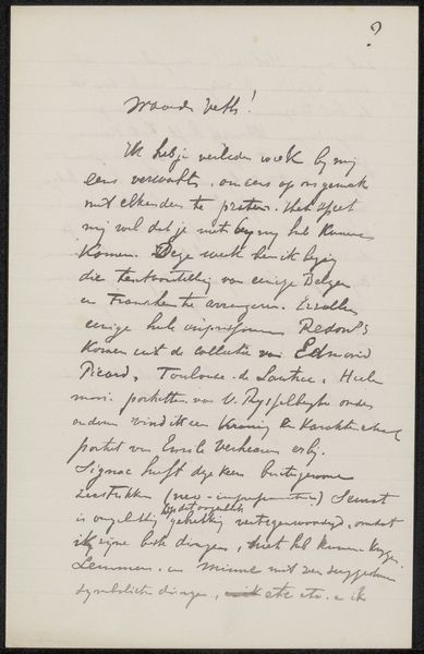
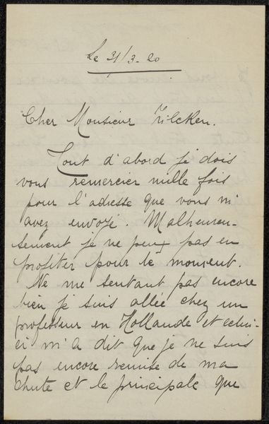
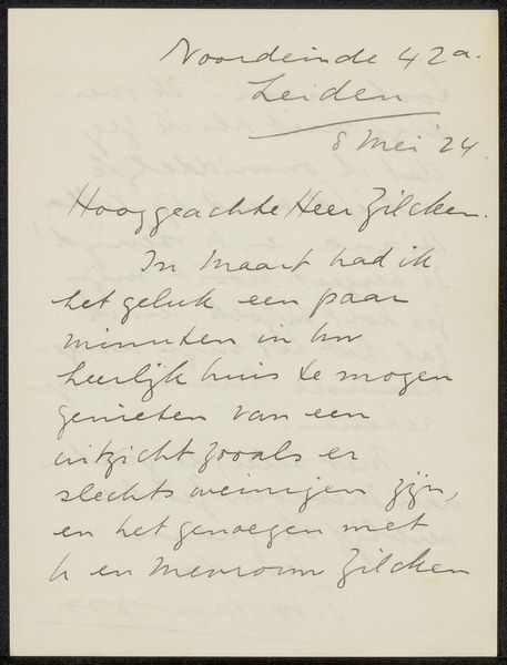
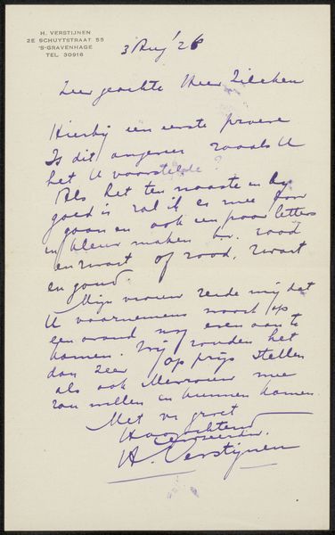
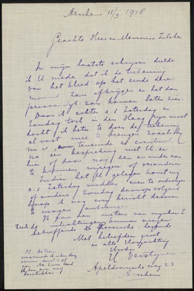
drawing, ink, pen
#
drawing
#
ink
#
pen
#
calligraphy
Copyright: Rijks Museum: Open Domain
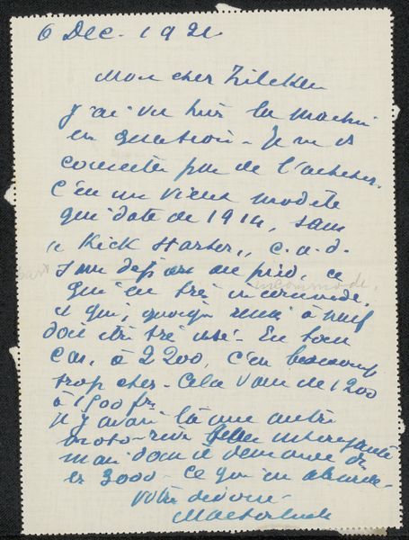
Editor: So this is "Brief aan Philip Zilcken," possibly from 1915, by A.F. van Bemmelen. It's an ink and pen drawing, but the style reads very much like calligraphy to me. The overall effect is very personal, like you're peering into someone's private correspondence. What jumps out at you about this work? Curator: For me, it's the materiality of the piece. The specific type of ink used, the paper’s texture—these are all deliberate choices, part of the means of production. What kind of pen was used and how did it impact the flow of ink? The very act of writing as a skilled practice speaks to labor, to time spent mastering the craft. Editor: That's interesting. I was focused more on the message itself, the content. Curator: But isn't the message intrinsically linked to the materials and method? This isn't just about the words, it's about how those words came into being. The consumption of materials – ink, paper – it all feeds into a narrative. Consider the context of 1915; what materials would have been readily available? Who had access to them? Editor: Okay, I see what you mean. So by looking at the ink and the paper, we can learn something about the artist’s resources, and maybe even their social standing? Curator: Precisely! We challenge the traditional idea of “high art” by investigating these seemingly mundane aspects of its creation. What was involved to create this? Editor: That makes me appreciate it on a deeper level. It's not just about the handwriting, it's about the entire process that led to this letter's existence. Curator: Exactly. Shifting our perspective helps unveil layers of meaning, even in a simple note. We begin to realize how much we can appreciate from such material to see more of history in one simple drawing.
Comments
No comments
Be the first to comment and join the conversation on the ultimate creative platform.
More like this