print, typography
#
portrait
#
aged paper
#
hand written
# print
#
hand drawn type
#
personal sketchbook
#
typography
#
hand-written
#
hand-drawn typeface
#
fading type
#
stylized text
#
handwritten font
#
columned text
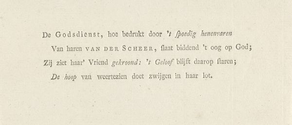
Dimensions: height 36 mm, width 84 mm
Copyright: Rijks Museum: Open Domain
Curator: We are looking at “Zesregelig gedicht behorend bij een portret van Augustus Sterk,” a 1794 print by Johannes (de Jonge) Lublink. At first glance, what strikes you about this piece? Editor: Immediately, I'm drawn to its almost fragile, ephemeral quality. The delicate linework and aged paper create a sense of something precious, a whisper from the past. The composition, a contained rectangle filled with orderly script, suggests precision. Curator: Indeed. This print functions as both text and image, existing in the realm of the portrait. Considering its context, 1794, what implications arise from framing this person, Augustus Sterk, within a poem? Editor: From a structural perspective, the vertical lines forming the background act as subtle dividers, visually organizing the textual blocks, each a separate line of verse. Curator: Precisely. Typography here does more than simply communicate; it contributes to constructing a particular narrative around identity. How do you interpret this particular form of stylized handwriting in relation to representations of self in that era? What does this text do? Editor: There is certainly an intentional contrast, wouldn’t you agree? Each letter carefully wrought to create uniformity with individual stylization in terms of weight and flourish. The overall uniformity hints at control. Curator: Yes, I see that also, but I perceive more defiance. Note, Sterk has his name boldly rendered—a declaration. Also, during a time of widespread revolution, choosing poetry is significant. Editor: I concur, as such a declaration becomes almost tangible and monumental; nonetheless, observe how the evenness of the writing—almost block-like in organization—counterbalances this defiance by reflecting rational thought. This interplay between rigid form and expressive potential adds depth. Curator: That's well observed! As we bring our discussion to a close, any further observations? Editor: This piece really exemplifies how visual texture and textual meaning can fuse. There's beauty in that unity. Curator: And hopefully it encourages us to reflect on how marginalized voices are reclaimed through artistic expression.
Comments
No comments
Be the first to comment and join the conversation on the ultimate creative platform.
More like this