print, woodcut
#
narrative-art
# print
#
dog
#
traditional media
#
figuration
#
woodcut
#
line
#
genre-painting
Dimensions: height 301 mm, width 378 mm
Copyright: Rijks Museum: Open Domain
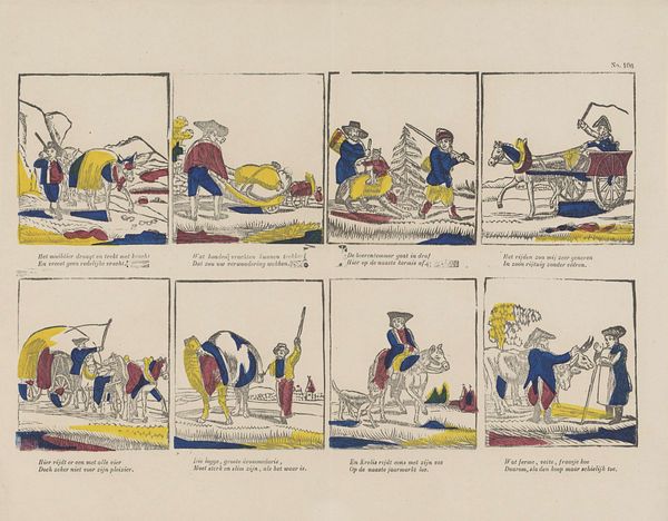
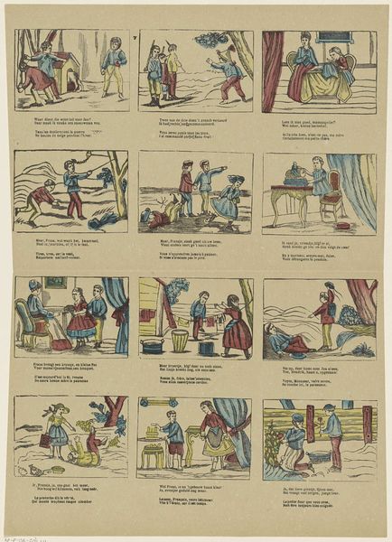
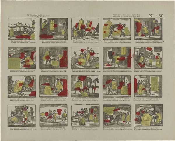
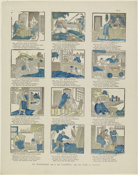
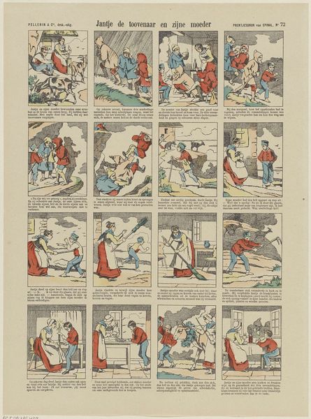
Editor: This is "De booze hond / Le chien méchant," a woodcut print by Philippus Jacobus Brepols, dating from between 1800 and 1833. It’s at the Rijksmuseum. The division into nine panels is striking. Each tells a mini-story, like a comic strip, but the coloring is quite unusual, using bold, flat areas of red, blue and yellow. What draws your eye in terms of the composition? Curator: Indeed, the division creates a fascinating rhythmic structure. Let's consider the formal aspects. The stark contrast between the gray of the figures and the blocks of color creates an interesting tension. Notice how the color doesn’t define form; rather, it acts as a purely decorative element layered upon the monochromatic figures. Are these colors symbolic? The red seems to indicate anger or distress. And the dog? Editor: It looks like the dog creates havoc. Someone is always running from it, yelling at it, or nursing an injury after an encounter with the hound. What does the relationship between the panels do? Does the order matter to the overall meaning? Curator: The sequence invites a semiotic reading. Each panel represents a signifier, a fragment of a narrative. But taken together, they could reveal underlying ideological structures regarding societal chaos versus the structure that we wish to obtain. Or is it the disruptive energy of the dog a necessity? How should the world look? Are dogs a necessary part of the ideal? I suspect not in the eyes of the citizens of the various panels. Editor: Interesting! Looking at the panels individually versus as a whole definitely changes the narrative. It adds another layer to interpreting the overall meaning, even from a formalist viewpoint. Curator: Precisely! Close analysis of the image through the visual and compositional relationships allows for nuanced interpretation.
Comments
No comments
Be the first to comment and join the conversation on the ultimate creative platform.
More like this