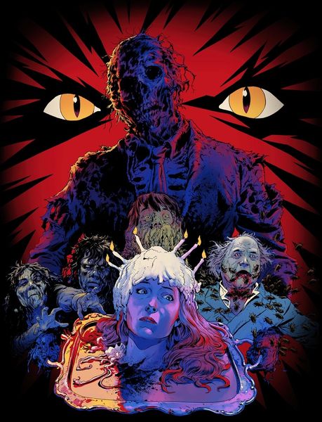
About this artwork
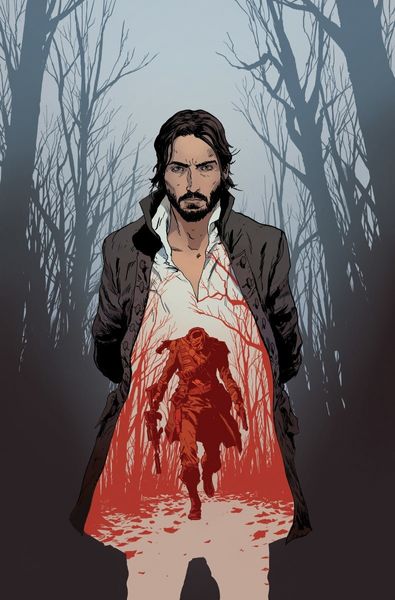
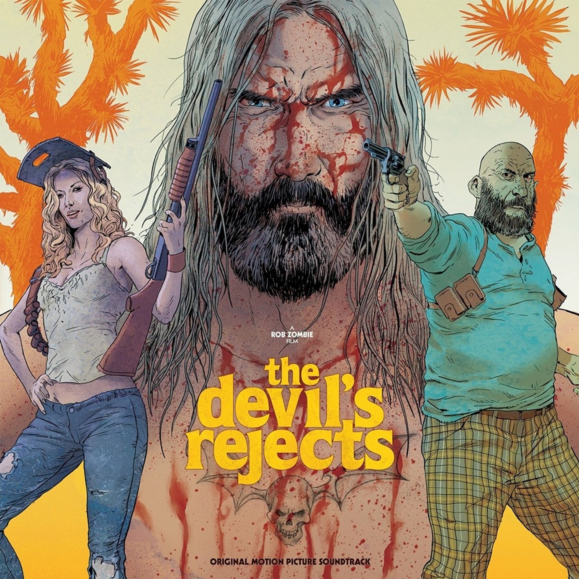
Robert Sammelin's "The Devil's Rejects" album artwork uses a comic style that feels both classic and contemporary, laying down flat areas of colour and defining forms with strong outlines. What strikes me is the textural contrast, especially in the rendering of the figures’ faces. Look at the juxtaposition of the meticulously detailed beard against the broader, more gestural handling of the blood. It's a dance between control and abandon, which really adds to the narrative tension. Then there's the colour palette, which is vivid and graphic, that enhances the comic book feel of the artwork. It makes me think of early Roy Lichtenstein, but with a darker, more twisted edge. Sammelin, like Lichtenstein, embraces the aesthetics of mass production, but he infuses it with a subversive, punk-rock sensibility. Ultimately, Sammelin reminds us that art is an ongoing dialogue, and that even in the darkest corners of our imagination, there is room for humour, experimentation, and the unexpected.
Artwork details
- Copyright
- Modern Artists: Artvee
Comments
Share your thoughts
About this artwork
Robert Sammelin's "The Devil's Rejects" album artwork uses a comic style that feels both classic and contemporary, laying down flat areas of colour and defining forms with strong outlines. What strikes me is the textural contrast, especially in the rendering of the figures’ faces. Look at the juxtaposition of the meticulously detailed beard against the broader, more gestural handling of the blood. It's a dance between control and abandon, which really adds to the narrative tension. Then there's the colour palette, which is vivid and graphic, that enhances the comic book feel of the artwork. It makes me think of early Roy Lichtenstein, but with a darker, more twisted edge. Sammelin, like Lichtenstein, embraces the aesthetics of mass production, but he infuses it with a subversive, punk-rock sensibility. Ultimately, Sammelin reminds us that art is an ongoing dialogue, and that even in the darkest corners of our imagination, there is room for humour, experimentation, and the unexpected.
Comments
Share your thoughts