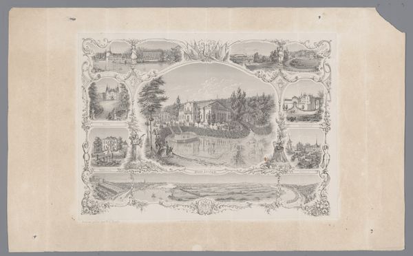
Menukaart voor de feestmaaltijd ter gelegenheid van de '35e Algemeene Vergadering der Nederlandsche Maatschappij ter Bevordering der Pharmacie' before 1886
drawing, graphic-art, print, engraving
drawing
graphic-art
pen drawing
old engraving style
woodcut effect
personal sketchbook
pen-ink sketch
pen work
sketchbook drawing
coloring book page
engraving
doodle art
intricate and detailed
Dimensions: height 145 mm, width 99 mm, width 198 mm
Copyright: Rijks Museum: Open Domain
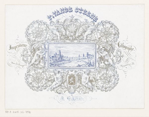
Editor: Here we have a rather ornate menu, "Menukaart voor de feestmaaltijd ter gelegenheid van de '35e Algemeene Vergadering der Nederlandsche Maatschappij ter Bevordering der Pharmacie'," dating back to before 1886, authorship unknown. It's a detailed engraving featuring some beautiful, if slightly stuffy, typography and a depiction of the restaurant it represents. All that meticulous detail is quite something. What do you see when you look at it? Curator: Well, beyond the delightful stuffiness—which, let's be honest, is half the charm of these historical documents—I see a real pride in place. It's not just about advertising a meal; it's about conveying a sense of establishment and history. Look at the almost ridiculously elaborate border, teeming with details. It frames the building as if it's a stately home, when, let’s be frank, it's likely just a fancy cafe near the station! And did you notice "Telephoon No. 110"? What a cutting-edge thing that would be back then! It is funny how the mundane becomes utterly fascinating with a bit of time, isn't it? It's almost like a miniature stage set. What do you make of that staging, visually? Editor: That’s a good point; staging implies an audience. I guess in this context, the audience is… potential diners? To me, the attention to detail signals the menu could double as a promotional piece for both the pharmacy gathering and W.J. Ponsen's Cafe. I noticed the coat of arms there above the words "Cafe Restaurant." Curator: Precisely! It's like they're trying to convince you that choosing this cafe is an act of civic duty. "Dine with history, dine with distinction!" Perhaps, given the meeting of pharmacists, they are looking for the kind of precision reflected in their crafts. A well prepared menu should reflect well-prepared food. It's wonderful how everyday items can tell us so much about a time, isn’t it? Editor: Absolutely. I hadn't really considered the 'performance' aspect before, or how menus reflected more than just the food. Thanks.
Comments
No comments
Be the first to comment and join the conversation on the ultimate creative platform.
