Dimensions: image: 203 x 279 mm paper: 292 x 349 mm
Copyright: National Gallery of Art: CC0 1.0
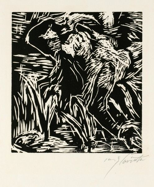
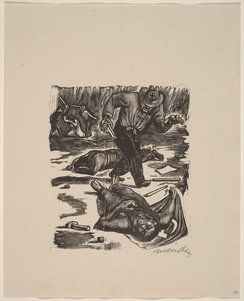
Philip Burnham Hicken made this print, called 'War,' at some point during his life. The deep blacks and stark white of the paper are so graphic; it feels like a memory, something both present and far away. The contrast is so bold it almost hurts your eyes, right? See how Hicken uses these little white dashes, almost like scratches, to suggest the ground, the texture of the land? It's not just about depicting a scene, it's about the feeling of being in it, or maybe remembering it. That fallen figure, it feels like a body, a shadow, a mass, like he is gone, almost like a minimalist sculpture. This reminds me a little of Kathe Kollwitz, with her emphasis on the graphic qualities of a print to tell a story. Both artists aren't interested in showing war as heroic, but as a human tragedy. It’s a powerful reminder that art doesn’t always have to be pretty; sometimes, it needs to be raw and honest.
Comments
No comments
Be the first to comment and join the conversation on the ultimate creative platform.
More like this