Copyright: Modern Artists: Artvee
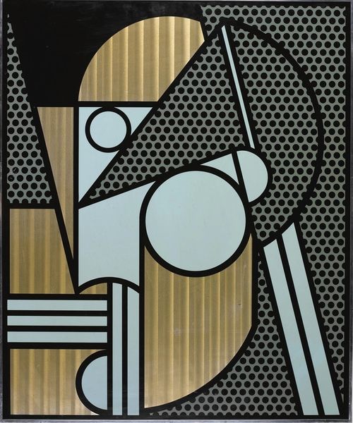
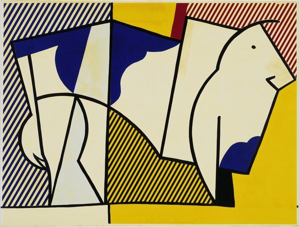
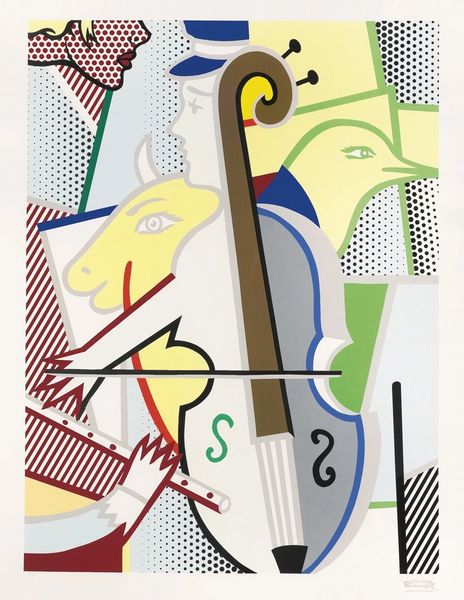
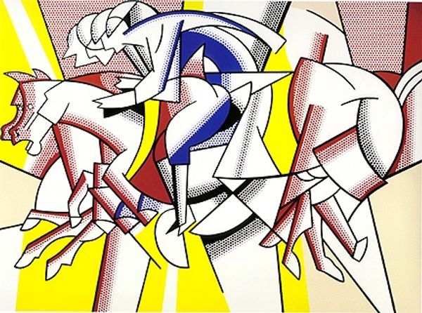
Roy Lichtenstein made this "Homage to Max Ernst" print in 1975, using screen printing to get those flat, bold colours. It's like he's having a conversation with Ernst, but in his own pop-art language. Looking at the image, you’ll notice how Lichtenstein simplifies everything down to these graphic shapes and patterns. It's so process oriented. It is not about what is represented but how it is. There’s this zebra-like pattern squished up against hard, vertical lines, all outlined in thick black. The flatness of the colors is striking, and the textures are all implied. It's all surface, right? You can almost feel the smoothness of the print. I keep coming back to that spiral detail; it feels like a little wink. It kind of summarizes Ernst's surrealist sensibility, like a dream trying to resolve into a recognizable form. Lichtenstein's nod to Ernst reminds me of how artists are always talking to each other, across generations and styles. It's an ongoing dialogue, with each artist adding their own voice to the mix.
Comments
No comments
Be the first to comment and join the conversation on the ultimate creative platform.