Copyright: James Rosenquist,Fair Use
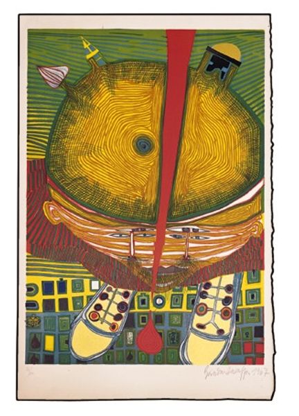
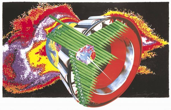
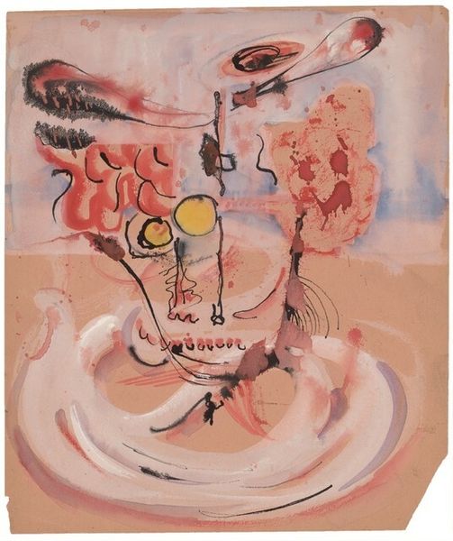
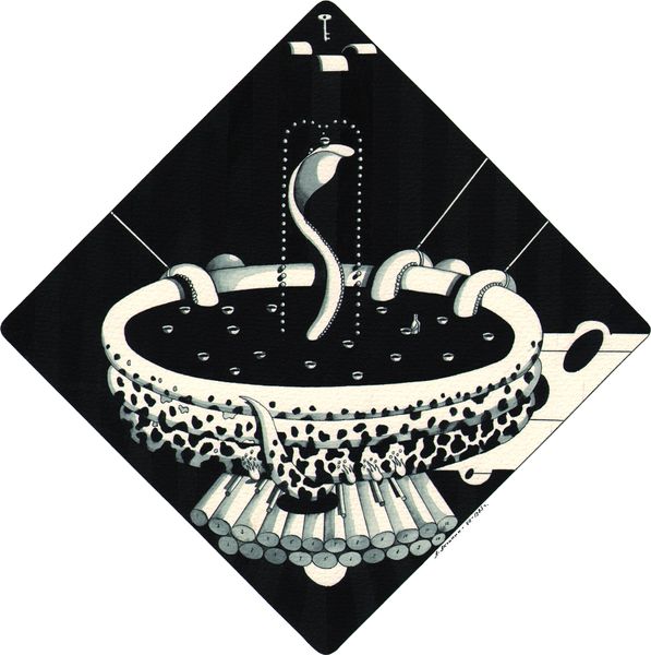
James Rosenquist made Where the Water Goes, a print, using collage and surreal imagery. Rosenquist, he’s interested in the layering of images. A sink basin is rendered with photorealist airbrushing. Then these sharp, abstract lines slice across the top. It’s this juxtaposition of clean, hard edges with soft focus, almost dreamlike imagery. The textures! Think of those smooth, metallic surfaces against the grainy, almost mottled background. It creates this weird, unsettling tension. Look at the way the faucet seems to drip not water, but pure, unadulterated color. That explosion of pink and yellow against the stark skull shape below feels like a collision of life and death, doesn’t it? Rosenquist is like a pop art predecessor to someone like David Salle, with his focus on juxtaposition and collage. But ultimately, art like this resists easy answers. It’s a process of seeing, feeling, and thinking, and coming to terms with the fact that maybe, just maybe, there’s no single right way to interpret it.
Comments
No comments
Be the first to comment and join the conversation on the ultimate creative platform.
More like this