painting, acrylic-paint
#
painting
#
minimalism
#
op art
#
acrylic-paint
#
geometric pattern
#
geometric
#
geometric-abstraction
#
abstraction
#
line
#
modernism
#
hard-edge-painting
#
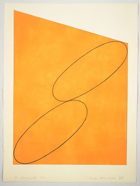
orange
Copyright: Robert Mangold,Fair Use
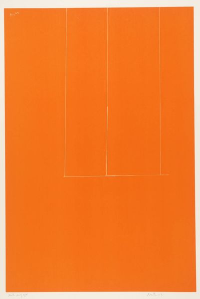
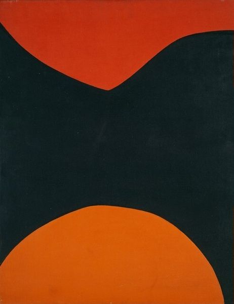
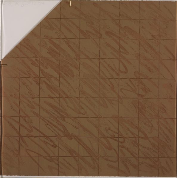
Editor: We're looking at Robert Mangold's "Column Painting 16" from 2004, an acrylic on canvas. The painting is mostly orange, but overlaid with curved lines that create a feeling of... structured flow. What do you make of it? Curator: Formally, the painting engages with a limited set of elements: color, line, and the support itself. Observe how Mangold divides the canvas into six distinct rectangles, yet uses a continuous line to create the illusion of a unified, spiraling form. This tension is quite deliberate. Editor: So the geometry contrasts with the organic curve? Curator: Precisely. Consider also the flatness of the orange field, which denies depth, while the curving lines suggest movement and spatial complexity. What effect does this have on the viewer? Editor: It almost tricks my eye! It's very simple, but it still messes with my perspective. Like an op art effect emerging from minimalism? Curator: A keen observation! The subtle tonal variations within the orange field—do you see them?—introduce a haptic quality, which counters the clean, hard edges that define the composition. The color operates not merely as a field but as an active element in creating perceptual depth. Editor: That makes a lot of sense! I appreciate how closely the painting ties its visual effect to deceptively simple methods. It almost feels like Mangold is showing how much can be done with very little. Curator: An insightful thought! Mangold consistently explores the intersection of geometry, color, and form to create artworks that question our understanding of space, perception, and the very nature of painting itself. The simplicity enables complexity.
Comments
No comments
Be the first to comment and join the conversation on the ultimate creative platform.
More like this