graphic-art, print, paper, typography
#
graphic-art
#
art-nouveau
# print
#
paper
#
typography
#
decorative-art
#
soft colour palette
Dimensions: height 375 mm, width 241 mm
Copyright: Rijks Museum: Open Domain
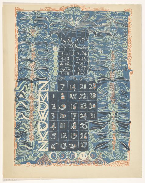
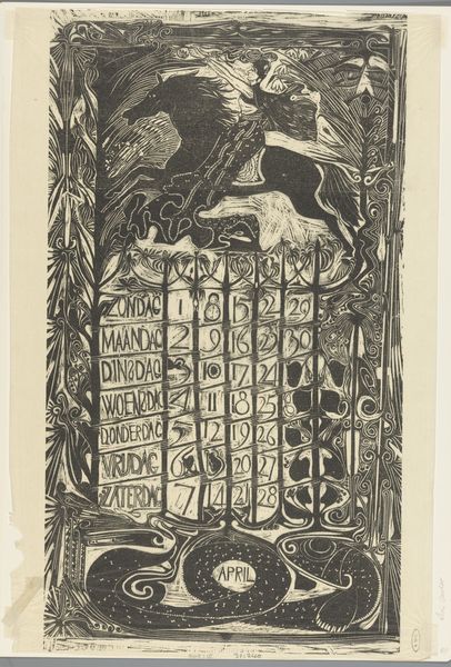
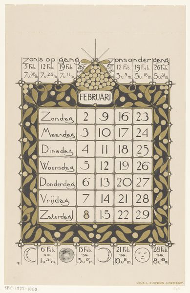
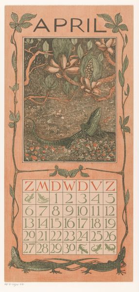
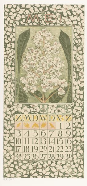
Theo Nieuwenhuis created this calendar sheet for December 1896 using etching and aquatint techniques. Note the symmetrical layout where flowing organic forms act as both decoration and structure. These winding, plant-like motifs in muted greens contrast with the stark, geometric grid of the calendar itself. This interplay between organic and geometric is more than decorative; it embodies a tension between the natural world and the human impulse to impose order. The Art Nouveau style, with its emphasis on natural forms, here frames the very structure that seeks to measure and contain time. The typography, in a bold red, draws your eye, emphasizing the function of the piece while integrating it into the overall design. Consider how the rigid, measured dates disrupt the fluidity of the surrounding design. It highlights a broader theme: how humans perceive and interact with our environment through systems of measurement and categorization. The calendar exists as a framework through which our lived experience is understood.
Comments
No comments
Be the first to comment and join the conversation on the ultimate creative platform.
More like this