print, photography
# print
#
photography
Copyright: Rijks Museum: Open Domain
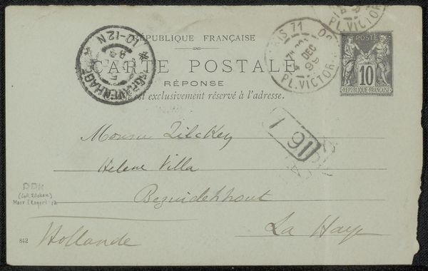
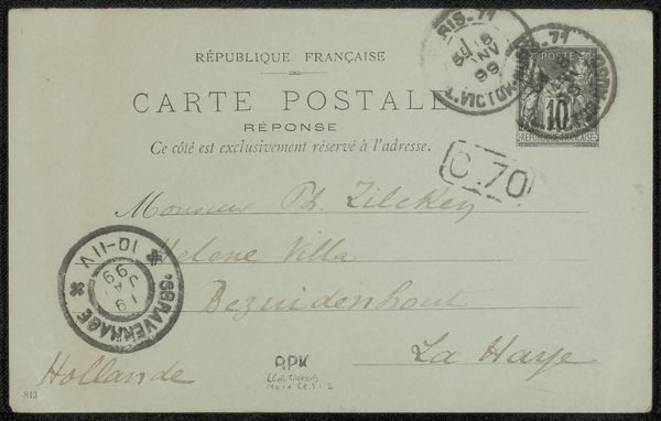
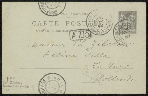
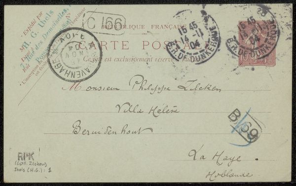
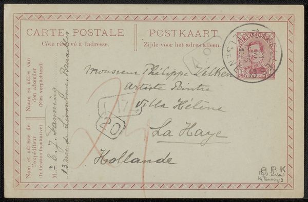
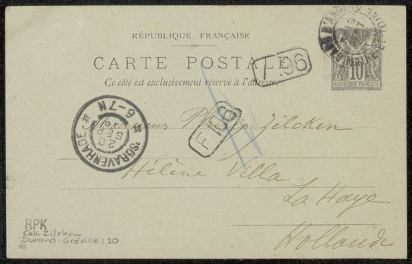
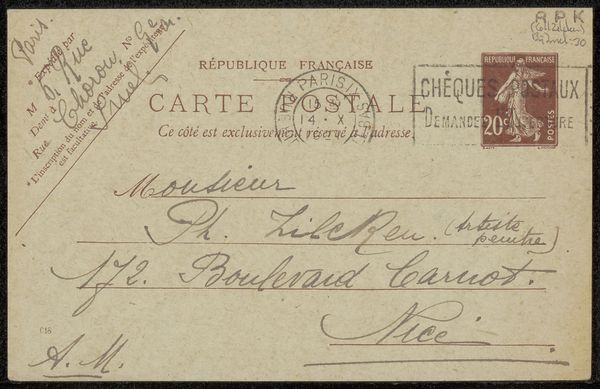
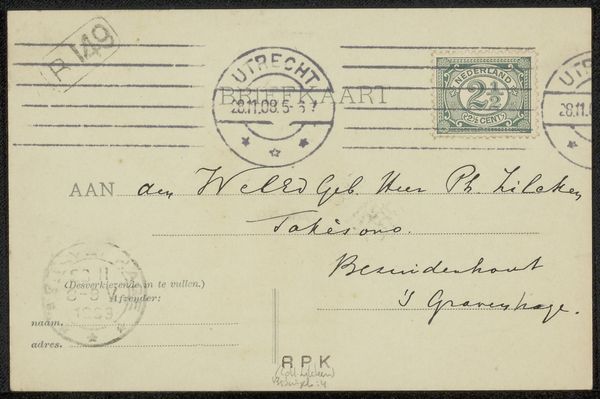
Editor: We’re looking at "Briefkaart aan Philip Zilcken," possibly from 1898, created by Émile Durand-Gréville. It combines print and photography on a postcard. It feels quite formal, almost bureaucratic, given the stamp and the various markings. What stands out to you in this piece? Curator: Immediately, the relationship between the various imprinted forms arrests my attention. Note how the grid-like structure of the stamp, with its central numeral '10', is juxtaposed against the circular forms of the postmarks. These act as framing devices, corralling the handwritten address into distinct visual planes. Durand-Gréville employs a strategic orchestration of shapes and textures. Observe also the varied typography – its size, weight, and placement – contributing to a visual hierarchy, segmenting the surface into areas of attention and information. Editor: So, you're focusing on the formal elements rather than, say, who Philip Zilcken might have been, or why the postcard was sent? Curator: Precisely. Consider how the smudges and irregularities contribute to the texture and visual weight, giving the object a depth of field often lacking in modern print. The aesthetic is intrinsically connected to its method of construction and the properties inherent in print media. Have you noticed how the off-white of the card affects the contrast? Editor: I see it now; it makes the text and markings stand out more starkly. It gives the postcard a sort of muted intensity. Curator: Yes, that subtle tonal variation is key to unlocking the postcard’s intrinsic design properties. We can now look closely at similar design properties of other postcards. Editor: That's fascinating. I'll definitely look at postcards differently now, paying more attention to those formal qualities.
Comments
No comments
Be the first to comment and join the conversation on the ultimate creative platform.
More like this