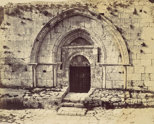
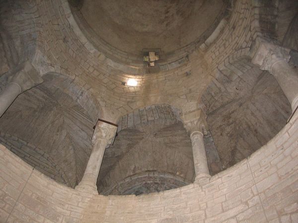
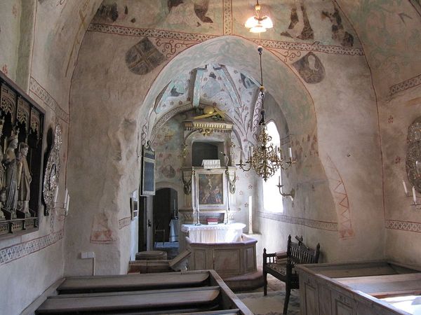
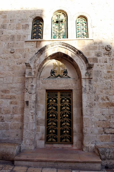
architecture
#
medieval
#
historic architecture
#
romanesque
#
building art
#
cityscape
#
history-painting
#
architecture
#
historical building
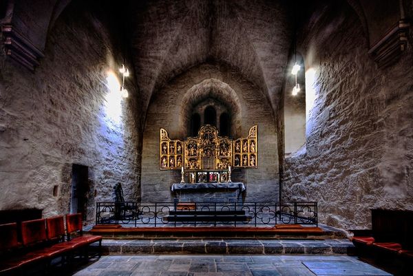
Copyright: Public domain
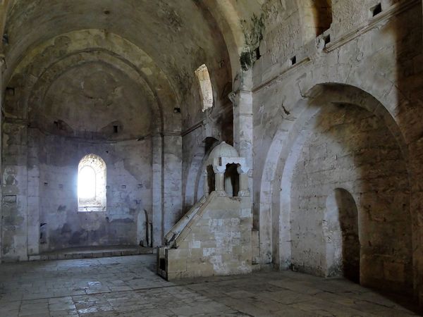
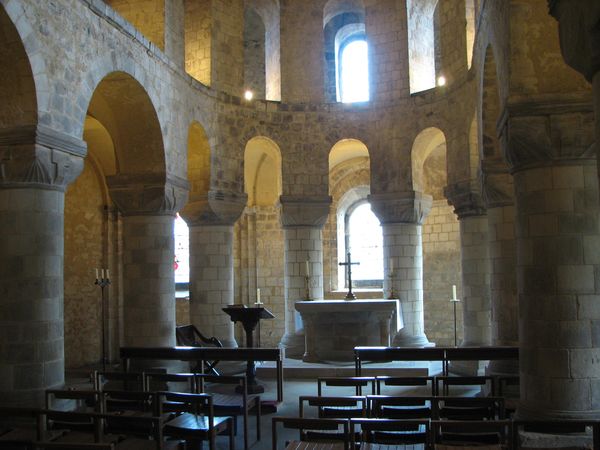
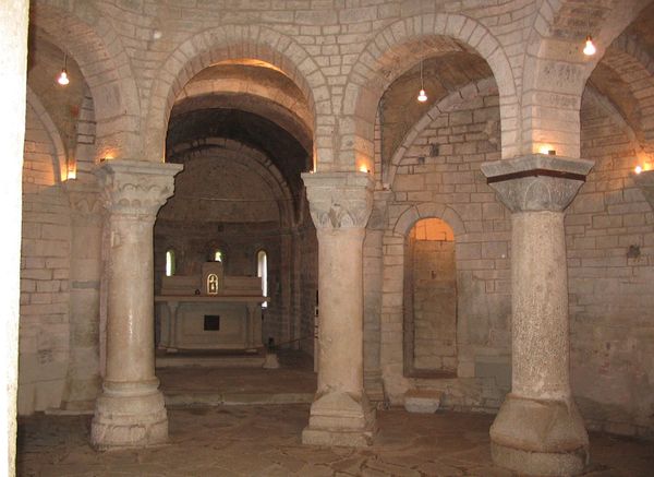
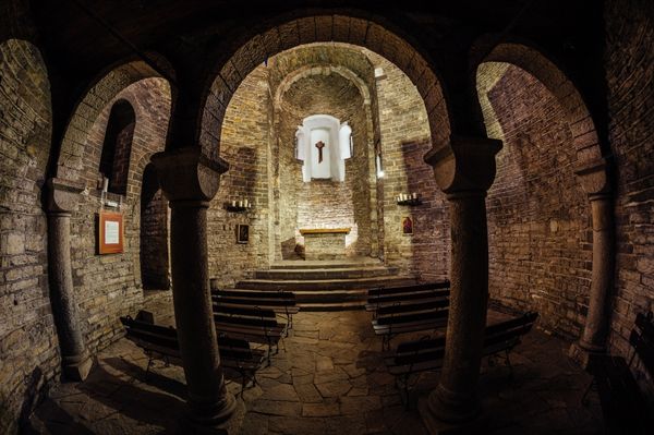
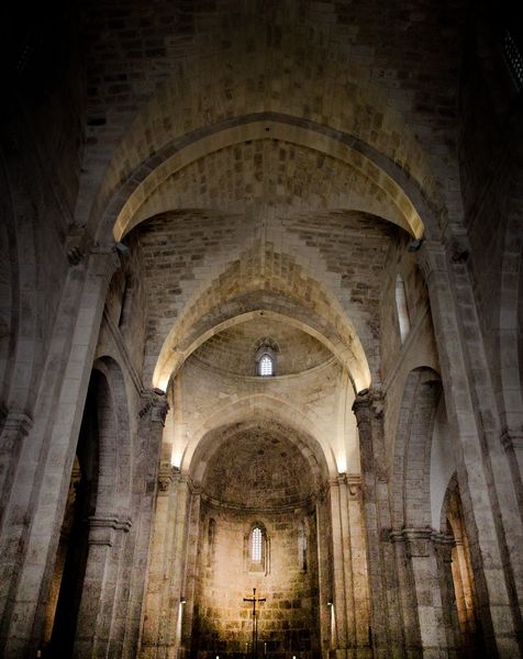
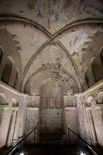
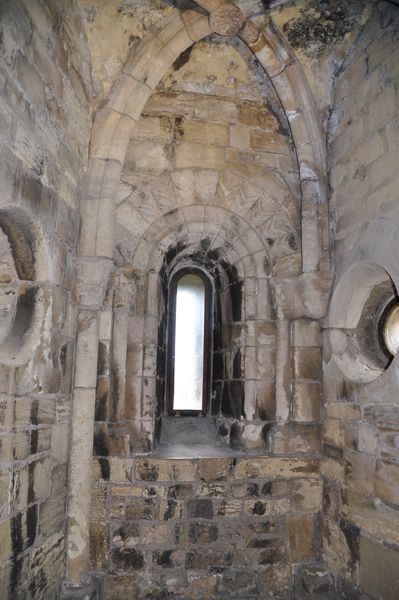
Editor: This is a view of the Sénanque Abbey in France, completed in 1148, a prime example of Romanesque architecture. I’m struck by the sheer scale of the space and the repetition of simple geometric forms. The masonry seems almost monumental. What do you see in this piece? Curator: I see an articulation of space purely through form and material. The cool-toned stone dominates. Observe the composition: the large oculus centers the space. The rounded arch repeats this shape, softened in smaller scale, in the side windows. The arched ceiling is a continuation, further expanding the form. How does this structured repetition affect the viewer, do you think? Editor: I think that structure provides a calming sense of order and the simple materials emphasizes this clarity. Do you think the materials enhance a certain type of reception for the user? Curator: Precisely. There is a rejection of applied ornament in favor of inherent qualities of material. Consider the texture of the stone, the pattern of the brickwork. These elements create visual interest, further enhanced by the illumination through each aperture, to highlight these subtle differences and to draw out patterns of visual interest within the building itself. The builders worked only with basic forms, and focused instead on pure structural geometry, Editor: So the beauty emerges directly from the form, and not in any decoration added on. Curator: Precisely. The fenestration of the large circular oculus is balanced by the careful articulation of other smaller openings, to create and capture light and volume and, ultimately, the sensation of structural integrity that, in effect, holds up the structure, and indeed, informs its artistic design. A dialogue between these apertures creates a certain play between light and shadow. The shadows emphasize the underlying shapes of this geometric structure. Editor: I appreciate the balance you pointed out in the play between light and shadows within a geometric pattern; it makes me see that there is a more deliberate interaction in a seemingly minimalistic design. Curator: And I'm refreshed to see a student appreciate an understanding that such simplistic balance in a space produces complexity and depth.
Comments
No comments
Be the first to comment and join the conversation on the ultimate creative platform.
More like this