drawing, paper, ink
#
drawing
#
hand-lettering
#
ink paper printed
#
hand drawn type
#
hand lettering
#
paper
#
personal sketchbook
#
ink
Copyright: Rijks Museum: Open Domain
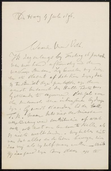
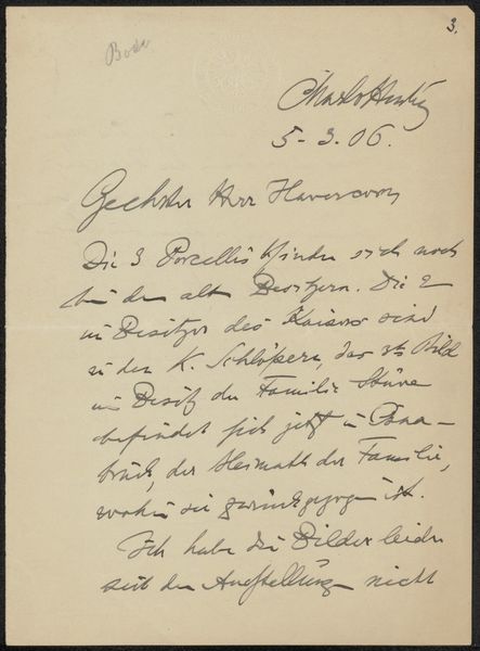
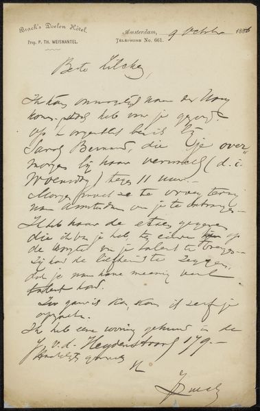
Editor: This is "Brief aan Pieter Haverkorn van Rijsewijk" or "Letter to Pieter Haverkorn van Rijsewijk," possibly from 1895 by Hendrik Petrus Berlage, rendered in ink on paper. The writing gives it an intimate, personal feel, but there's also a formal structure to it. It feels both like a snapshot of a thought and something deliberately composed. As a cultural artifact, what strikes you most? Curator: Considering Berlage’s architectural background, it's fascinating how he treats the page like a blueprint for communication. Letters at this time served not only as personal correspondence, but were key for professional networking and solidifying reputations. Notice the carefully lettered heading establishing his credentials - "Architect," the address... This visual emphasis wasn’t merely practical; it signaled Berlage's status within the architectural and artistic community. Editor: So it was like branding, even back then? Curator: Precisely. The handwriting itself contributes. While personal, it possesses a calligraphic quality. The legibility was crucial, but so was projecting a certain persona - educated, refined, trustworthy. Think of the letter's role within the broader context of architectural debates in the late 19th century. Berlage was a key figure in shaping modern Dutch architecture. How might this seemingly simple letter function in constructing his influence? Editor: I guess I hadn’t thought of it as more than just a letter. It's like a carefully constructed performance. This piece reveals so much about the social and professional expectations placed on people at that time. Thanks. Curator: Indeed, and it makes me wonder: how do we "perform" ourselves in our digital correspondence today? Perhaps less elegantly!
Comments
No comments
Be the first to comment and join the conversation on the ultimate creative platform.
More like this