Dimensions: 61 x 95 cm
Copyright: Public domain
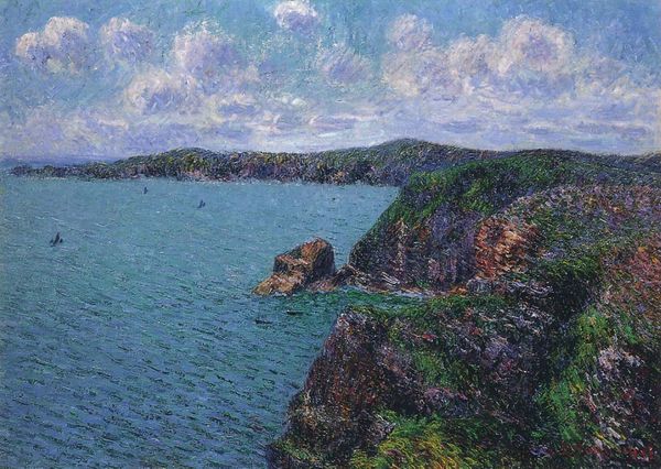
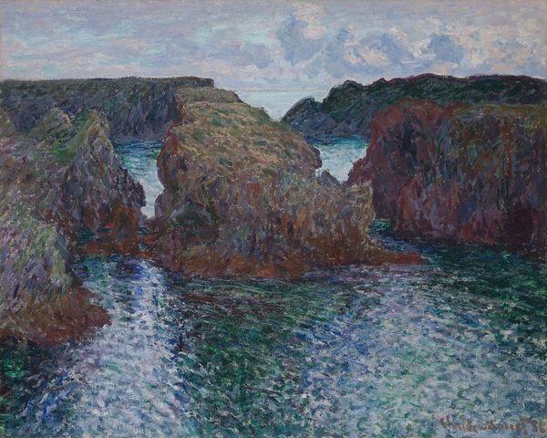
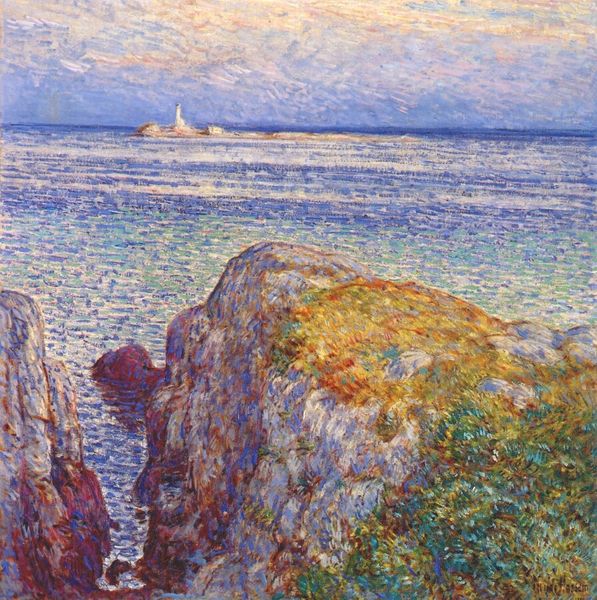
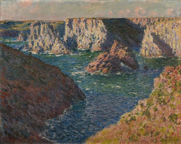
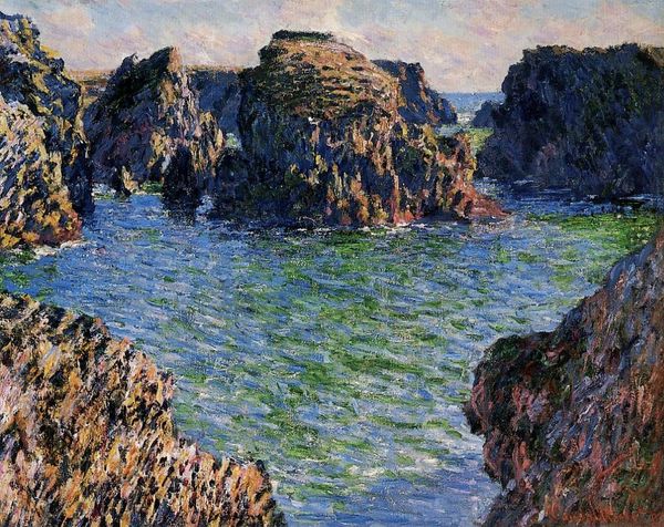
John Peter Russell painted La Pointe de Morestil par mer calme with oil on canvas, and it’s like he’s wrestling with the scene, not just copying it. You can see it in the marks. The texture is really where it’s at, right? Look at the cliffs. They're built up with these short, choppy strokes, like he’s sculpting the rock face with pure color. The blues, reds, and yellows aren’t blended so much as placed next to each other, buzzing with energy. Then, down in the foreground, the sea is rendered in these flatter, horizontal strokes that give a sense of calm and distance. It’s the opposite of the cliffs. Russell was kicking around with Van Gogh and Monet, so it’s hard not to see the echoes of those guys here. But he brings his own thing, a certain looseness. It’s like he’s saying, “Here’s what I saw, but more importantly, here’s how I felt.” And in the end, isn't that what art is all about?
Comments
No comments
Be the first to comment and join the conversation on the ultimate creative platform.
More like this