Copyright: Rijks Museum: Open Domain
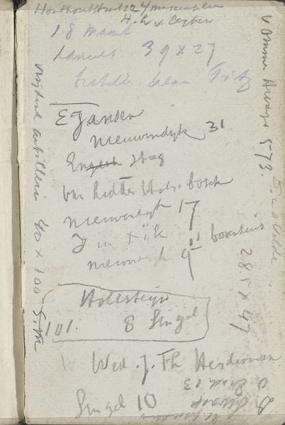
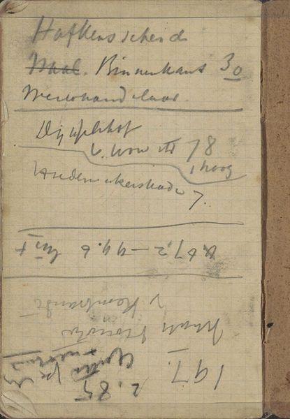
Editor: Here we have "Notities over kunstwerken" – Notes on artworks – by Gerrit Willem Dijsselhof, created sometime between 1876 and 1924. It's a mixed-media drawing on paper. It looks like a page from a sketchbook, filled with handwritten notes…almost like a glimpse into the artist's mind. What jumps out at you? Curator: Initially, one notes the fascinating interplay between the textual and the visual. The very act of writing, the shapes of the letters, their arrangement on the page – these elements constitute a visual field in and of themselves. Consider the materiality of the paper, its texture as implied through reproduction. And then the lines of script, dark against the ground – a rhythm is established. Editor: So, you're saying the handwriting isn't just about conveying information, but is part of the artwork's composition? Curator: Precisely. Observe the varying densities of the script, the way certain words are emphasized through size or placement. Do you notice how these textual “marks” behave formally, creating a structure across the plane? Editor: I see what you mean. The sizes and spacing create a kind of irregular grid. But what about the content of the writing? Doesn’t that matter? Curator: While content undoubtedly provides context, our formalist approach privileges the *how* over the *what*. How does the inscription function as form? The looping ascenders and descenders create lines. Ultimately, we confront a work where language becomes texture, where meaning is embedded not just in denotation, but in the visual dance of signifiers on a surface. Editor: It’s interesting to think of words as shapes and textures. I’ll definitely look at handwriting differently now. Curator: Indeed. The semiotician in me encourages the viewer to question what the intention or purpose was with this piece.
Comments
No comments
Be the first to comment and join the conversation on the ultimate creative platform.
More like this