drawing, print, etching
drawing
baroque
etching
landscape
cityscape
Dimensions: height 118 mm, width 176 mm
Copyright: Rijks Museum: Open Domain
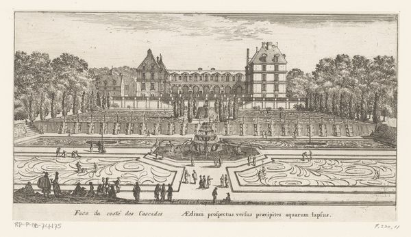
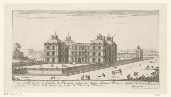
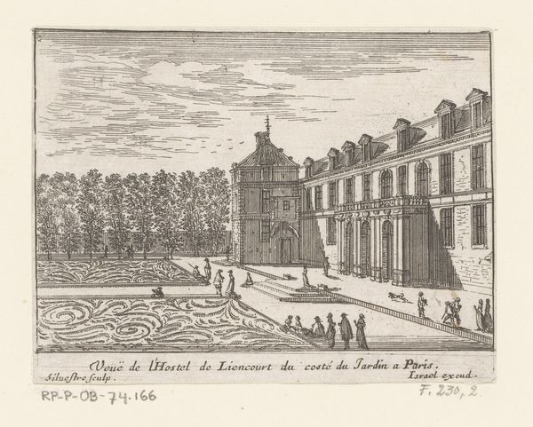
Curator: Israel Silvestre produced this etching in 1655. Titled "Gezicht op het Palais du Luxembourg," it offers a fascinating glimpse into the architecture and social landscape of the period. Editor: It feels…formal, rigid, even. The severe symmetry, those sharply defined lines of the etching. It’s a very controlled and controlled kind of beauty. Curator: That's characteristic of Baroque sensibilities. We see this aristocratic ideal reflected, not just in the palace architecture, but also in the very meticulous arrangement of the gardens. Consider the function of the Luxembourg Palace as a seat of power and how Silvestre’s rendering supports that image. Editor: Yes, power is certainly communicated! The sharp perspectival view—centered on the main structure—lends a theatrical feel. It's less a document and more a performance of dominance and order. Curator: This reminds us that visual representations played a crucial role in solidifying power. Etchings like this, circulated widely, served as visual propaganda, projecting an image of sophistication and stability to both domestic and international audiences. Note, too, the small figures included within the grounds: they reinforce the scale of the building while underscoring an impression of vibrant, fashionable public life. Editor: Though tiny, these figures—they introduce a counterpoint. Their leisurely activities soften the stark geometry of the palace and gardens, which mitigates the otherwise potentially imposing effect. The palace would feel like an absolute monolith without them. Curator: Precisely! Silvestre was astute in crafting a balanced view—displaying grandeur while suggesting an accessible elegance. And the prints themselves become tools for disseminating these powerful social ideas to an ever wider public. Editor: Looking closely, it seems a balance has been sought out in the work’s tonal range also. I wouldn't call this merely informational! The engraver's skills have crafted more than a flat record; here’s depth of visual texture adding considerable atmospheric qualities and depth, beyond simple data recording of location. Curator: A good observation. What begins as documentation transforms through artistry into so much more: these pieces shape understanding and social attitudes. Editor: I came to understand this work initially in aesthetic terms, though I concede your point that beyond aesthetic decisions, the politics here are pretty hard to overlook. Curator: And to me, analyzing those politics, without observing Silvestre's artistry feels somehow inadequate! It really comes down to complementary approaches when engaging with any artwork.
Comments
No comments
Be the first to comment and join the conversation on the ultimate creative platform.