drawing, pen
#
drawing
#
narrative-art
#
baroque
#
figuration
#
pen
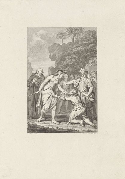
Dimensions: height 338 mm, width 401 mm
Copyright: Rijks Museum: Open Domain
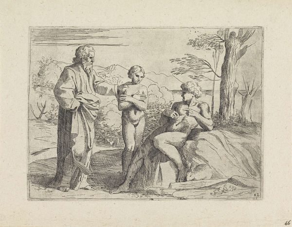
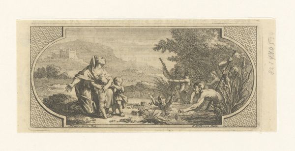
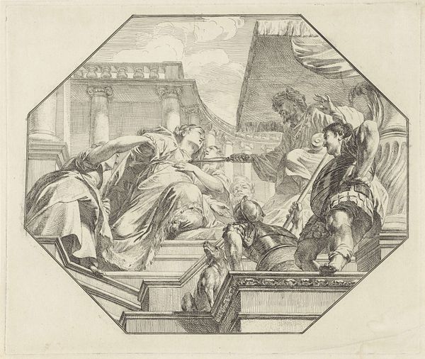
Editor: Here we have Jacob de Wit's "The Temptation of Christ," a pen drawing created sometime between 1705 and 1754. The composition is striking. The figures are placed dynamically within the octagonal frame, creating a real sense of depth and movement. What do you notice first about the composition and its visual components? Curator: I'm immediately drawn to the dichotomy in posture. Notice how the tempter is depicted in a subservient, almost pleading posture, while Christ is portrayed as seated and serene. This contrast in bodily form mirrors the moral opposition within the narrative. Editor: Absolutely. The flowing lines and loose rendering contribute to the dynamic baroque feel, but the medium restrains it, no? It’s all so detailed, it could come from life. Curator: Indeed. But the linear precision also gives it structure. Semiotically, line and contour become carriers of meaning. We may consider line as form, boundary, but also as a system of visual language that constructs an inner sense and an expression of a certain era. This artwork provides a clear indication of the aesthetic trend prevailing at that time. Do you see this here as a construction of that time, reflecting upon religion? Editor: Yes, absolutely! It highlights how artistic interpretation is always shaped by socio-political context. Curator: Precisely! Focusing on how visual elements communicate, we find more comprehensive perspectives and comprehension. Thank you for providing your thoughts on the work, which added great context to our conversation. Editor: And thank you for elaborating on the details which influence its core structural integrity. I’ve enjoyed deconstructing it with you today!
Comments
No comments
Be the first to comment and join the conversation on the ultimate creative platform.
More like this