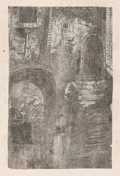
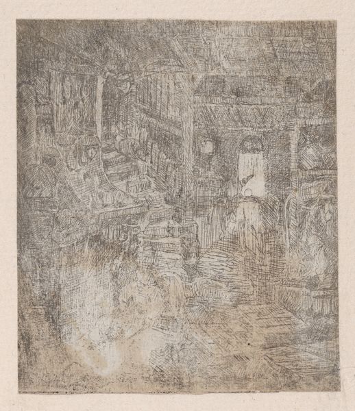
drawing, ink, pen
pen and ink
drawing
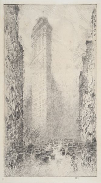
narrative-art
pen sketch
ink
sketchwork
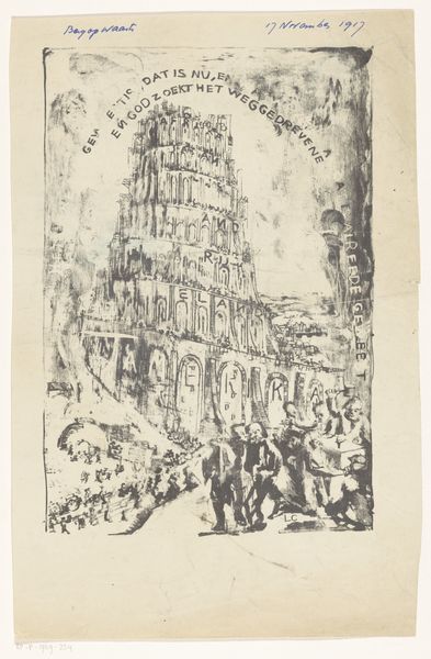
symbolism
pen
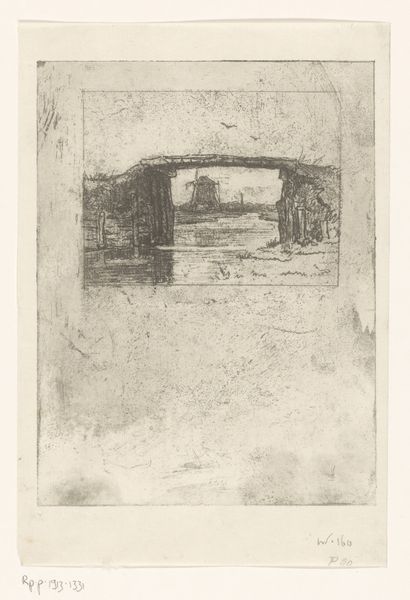
cityscape
Dimensions: height 361 mm, width 217 mm
Copyright: Rijks Museum: Open Domain
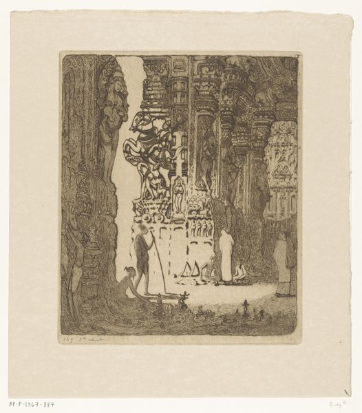
Curator: This unsettling sketch is called "Toren met landennamen," or "Tower with Country Names," possibly dating from 1917. It's attributed to Carel Adolph Lion Cachet. Notice the pen and ink medium used to depict this imposing structure. Editor: It has a somber mood. The lines are scratchy, and the tower leans ominously, with a strange combination of precision and dissolution. The pallid tones are perfect for symbolizing chaos. Curator: Absolutely. Cachet created this work during a turbulent period in European history—World War I was raging. The names of countries inscribed upon the tower allude to the political landscape of the time. It invokes the Tower of Babel, and the futility of trying to force everyone to be in accord. Editor: I can see the connection to Babel. There's a definite fragmentation suggested by the irregular forms. Each section, adorned with a country's name, seems unstable, almost on the verge of collapse. It looks more like a ruin than a symbol of unity or ambition. Curator: And if you look closely, there's a crowd scene at the base of the tower, full of turmoil, and people being forced into cooperation. These are the citizens of Bergopwaarts, compelled by order from above, who will inevitably fall back on internal national forces. Editor: What strikes me most is the tension between the realistic architectural details—those archways and window-like structures—and the overall sense of unreality and nightmarish ambition. There is no balance and it seems to lean to the side, ready to fall, making us fear for the worst, Curator: The inscription around the tower, translated as "What has been, is now, and what shall be, has already been," speaks to a cyclical view of history, particularly poignant amidst the devastation of the First World War. There will be war, and it will not end quickly. Editor: For me, the power lies in the contrasting textures: the dense hatching versus the open space, the bold outlines versus the faded washes of ink. It’s the dynamic interplay of these elements that elevates the work. Curator: Indeed, it prompts us to contemplate the weight of history and the complexities of international relations at that historical time. Editor: Yes, it certainly reveals how the artist captures a deep sense of disillusionment with the grand projects of human ambition.
Comments
No comments
Be the first to comment and join the conversation on the ultimate creative platform.