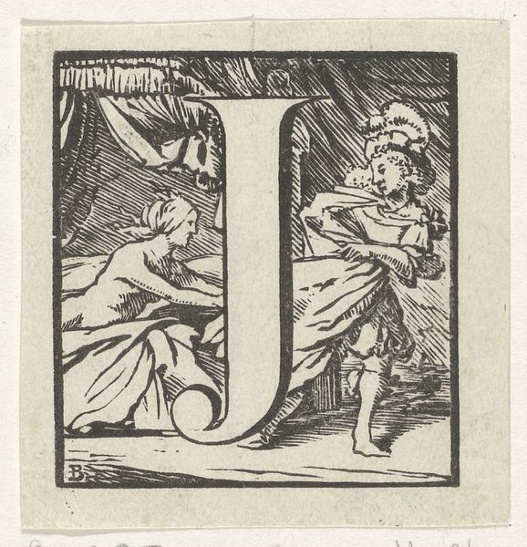
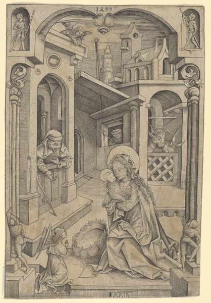
Letter E in een omlijsting met een voorstelling van de bestraffing van de kinderen die Elisa bespotten 17th century
0:00
0:00
print, woodcut, engraving
#
medieval
#
narrative-art
# print
#
old engraving style
#
figuration
#
woodcut
#
engraving
Dimensions: height 65 mm, width 65 mm
Copyright: Rijks Museum: Open Domain
Editor: We’re looking at a 17th-century print titled "Letter E in een omlijsting met een voorstelling van de bestraffing van de kinderen die Elisa bespotten." It's an engraving, and its graphic nature is striking, especially the figure within the letter E itself. How do you interpret this work formally? Curator: The strength of this piece lies in its contrasting textures and the balanced distribution of visual weight. Note how the crisp lines defining the letter 'E' create a strong, geometric framework. Within this, the artist masterfully renders depth using only line and negative space to depict a chaotic, almost violent, scene. Observe the figure of the man; the linear density of the lines comprising his drapery gives him a commanding presence, almost overpowering the activity within the letter. What strikes you about the relationship between the figure and the letter? Editor: I find it interesting that the figure almost seems to be emerging from the letter, bridging the gap between the textual and the representational. The diagonal lines in the trees direct my eyes downwards towards the figure, and then I jump over to the boy on the left of the image. The artist made some unique choices in the linear composition! Curator: Precisely. The linear perspective is flattened, pushing the scene to the forefront and intensifying its impact. Even the rendering of light is subordinate to the delineation of form, further emphasizing the abstract qualities of the medium. Did you also notice that the trees in the letter contain less linear density than the main figure on the right side of the composition? What would that signify? Editor: That makes me think about foreground versus background, and drawing the viewer into that dichotomy through textural and geometric forms, and the interplay of light and dark inherent within that choice. I guess I can understand this print on a deeper level now! Curator: Indeed, a deeper reading can lead to appreciation. Paying attention to the artist's method in the distribution of shapes allows for such clarity in understanding their message.
Comments
No comments
Be the first to comment and join the conversation on the ultimate creative platform.
More like this