Copyright: Olle Baertling,Fair Use
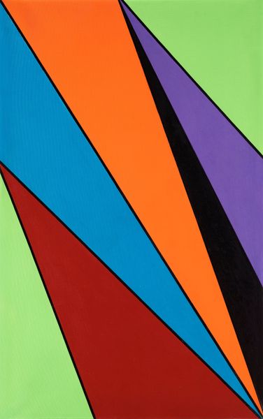
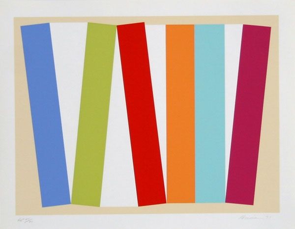
Editor: This is Olle Baertling's "Flags for America's Cup" from 1977, made with mixed-media, likely including textile and printing techniques. The sharp diagonals of orange, purple, and teal are quite striking and dynamic. What do you make of the composition and colour choices here? Curator: Indeed. The intrinsic elements provide the entry point to this visual experience. Note how Baertling exploits the interplay between these three hues. Orange, in its saturated vibrancy, is sharply contrasted against a grounding expanse of purple, pushing our depth perception. Further, the diagonal band of teal creates a rhythmic pulse, serving to both divide and unite the contrasting colour fields. What might such angularity communicate? Editor: I see it as a visual disruption, like a speeding yacht cutting through water. But is it possible this angle and composition give us information about the way this was constructed? Curator: A critical point. The textile as medium carries implications beyond mere pictorial representation. Its materiality introduces tactile elements – texture and pliability - creating tensions with the formal, geometric, and linear forms contained therein. The seemingly simple act of choosing the flag as a surface challenges any illusionistic depth we may be inclined to read in. In which sense, the work then moves away from being merely about seeing. Editor: So the flag itself is significant to the viewing experience and interpretation of form and colour. The materials themselves make us more aware of its flatness? Curator: Precisely. The inherent two-dimensionality of the flag challenges traditional perspectival readings and prioritizes surface and shape, effectively positioning us as active readers, engaged with the formal components foremost. What does that perspective then give us as viewers? Editor: It definitely encourages you to focus on the relationships between shapes and colours instead of trying to see it as any kind of scene or… or thing. Curator: Yes, we understand how Baertling privileges abstraction above illusion. By isolating color and form, Baertling’s construct seeks the essentials of visual harmony, and thus asks the viewers to feel it foremost. Editor: Thanks. Now I appreciate how its impact hinges on how we actively consider these aesthetic features.
Comments
No comments
Be the first to comment and join the conversation on the ultimate creative platform.
More like this