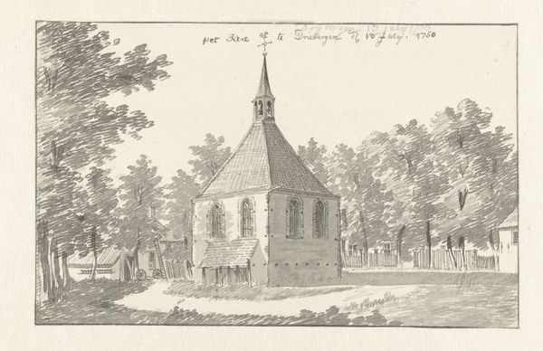
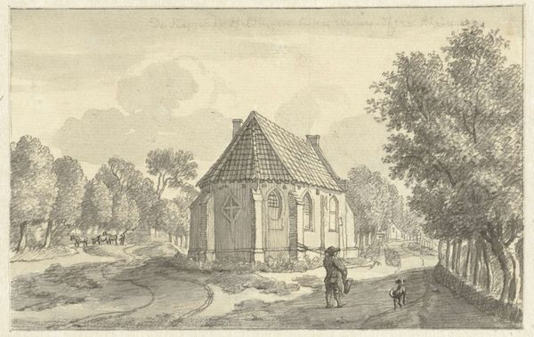
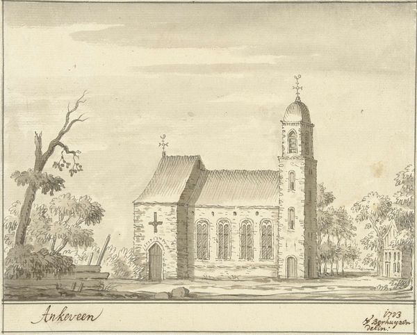
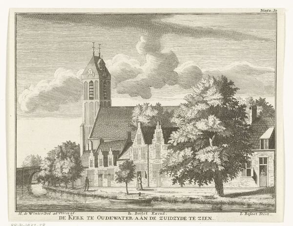
drawing, etching, paper, ink, architecture
#
drawing
#
dutch-golden-age
#
etching
#
landscape
#
etching
#
paper
#
ink
#
genre-painting
#
architecture
#
realism
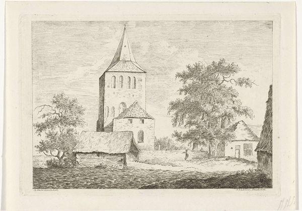
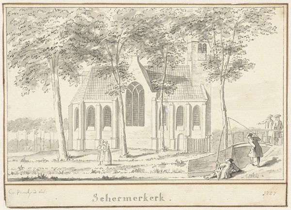
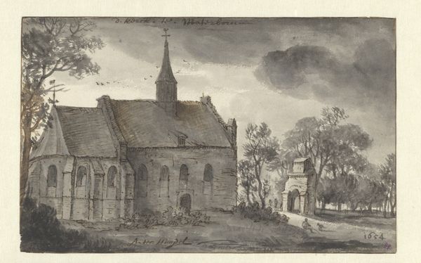
Dimensions: height 140 mm, width 178 mm
Copyright: Rijks Museum: Open Domain
Curator: Cornelis Pronk rendered this scene, "De kerk in de Schermmeer," using ink and etching on paper around 1729. What strikes you first about it? Editor: There’s a certain placidity to the image; it feels serene, almost deliberately ordinary. The tonal range is narrow, adding to that sense of quietude. Curator: Consider how the etching process itself—the repeated biting of the plate by acid—serves the meticulous detail of the thatched roof, or the textured foliage. Each line is evidence of a slow, deliberate construction. What cultural echoes resonate for you, considering it’s a church depicted in this manner? Editor: Well, the church itself acts as an obvious signifier, but here it isn’t grand or imposing. Its quiet presence, nestled among the trees, lends it a feeling of permanence within the Dutch landscape, of stability and tradition rooted in that community’s memory. The church’s architectural symbols speak to communal identity. Curator: The materials – humble paper, locally sourced inks – contrast with the elevated subject of the church, a juxtaposition reflecting the emerging power of the Dutch merchant class. Consider also how such works could be disseminated, consumed, reproduced and shared through printing…a new form of access, ownership and control over images in society. Editor: Yes, its dissemination makes the scene both more intimate and accessible to a wider public. This very modesty may be its strength: It isn’t about power, but about the personal relationship between the individual and their community’s spiritual home, represented in simplified imagery that is widely recognizable. It feels very relatable. Curator: Absolutely. Pronk's method reflects a shift, from the grand religious commissions to this more intimate portrayal accessible to the common citizen. It brings religion into everyday life through accessible prints. Editor: Precisely! The power isn’t in the iconography of the steeple but in the common field. Its resonance lies in recognizing ourselves as inheritors of this enduring image of quiet faith. Curator: An interesting and accessible reflection of religious and cultural symbols. Thanks for sharing that. Editor: Likewise! Examining the quiet symbols that remain with us still gives meaning to my interpretation.
Comments
No comments
Be the first to comment and join the conversation on the ultimate creative platform.
More like this