painting, acrylic-paint
#
portrait
#
contemporary
#
character portrait
#
painting
#
acrylic-paint
#
figuration
#
comic
Copyright: Modern Artists: Artvee
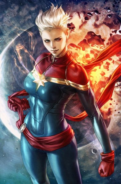
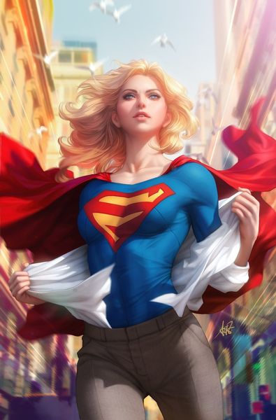
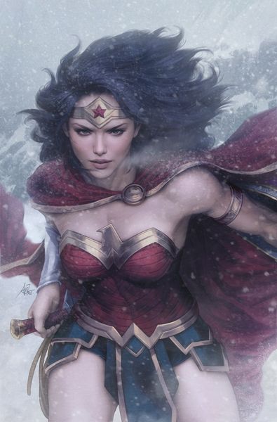
Editor: This is Stanley “Artgerm” Lau’s cover for Captain Marvel #1, an acrylic painting offering a fresh take on a classic superhero. It feels very contemporary, but what strikes me is the tension between the realism of the figure and the fantastical space backdrop. How do you read the formal elements here? Curator: Notice how the artist uses a very limited, albeit vibrant, color palette of reds, blues, and golds. These primary colors, symmetrically positioned across the composition, create a visual harmony that draws the eye to the center of the canvas. The angularity of her stance, contrasted by the softness of the hair and swirling space dust, provides another important juxtaposition. Are these contrasts simply decorative or are they, perhaps, suggestive of inner conflict or strength? Editor: That’s a good point about inner conflict – I didn't consider that initially. I was focused on how the hard lines of the costume kind of compete with the painterly background, making it visually dynamic, but perhaps a bit jarring. Curator: Precisely. The artist skillfully guides our gaze using chiaroscuro; light and shadow define the contours of her figure, emphasizing form and volume. Note, too, how Artgerm renders the textile qualities, from the smooth metallic finish on the chest plate to the soft glow of the energy blasts in the background. How might these technical considerations support a reading beyond face value? Editor: I now see that the painting is far more than a portrait; it's an exploration of opposing forms. I really appreciate how you pointed out the subtle choices of light and color. Thank you! Curator: It's in recognizing and exploring these intentional juxtapositions of forms, as well as contemplating the absence of other elements, that the deeper narrative of the work truly comes alive.
Comments
No comments
Be the first to comment and join the conversation on the ultimate creative platform.
More like this