#
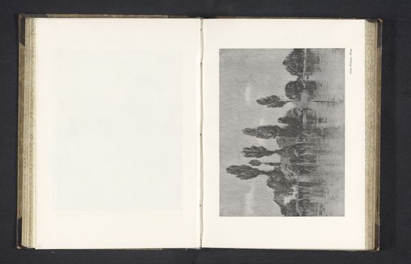
tree
#
type repetition
#
aged paper
#
toned paper
#
homemade paper
#
ink paper printed
#
woodcut effect
#
paper texture
#
golden font
#
historical font
#
columned text
Dimensions: height 102 mm, width 182 mm
Copyright: Rijks Museum: Open Domain
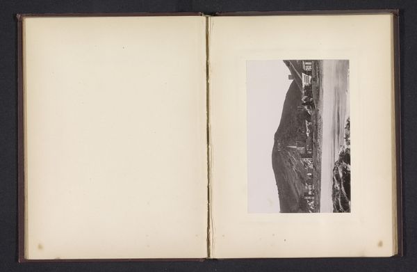
Heinrich Kuhn made this photograph, "Drie huizen en een rij bomen", with what looks like a lot of careful consideration of tonal range and depth of field. The print is contained within a kind of album, where the photograph is pasted to a page. I think the relationship of the picture plane to the page is really interesting here. The photograph is sort of floating away into the distance, while the matte paper it’s stuck to is right there, present. It's got some really beautiful dark and light areas that aren't really black or white, more like shades of grey. The buildings and trees almost look like they have been stencilled, or drawn with a really soft charcoal. Thinking about the formalist quality of this image, I keep coming back to the work of Gerhard Richter. Though Richter used blurring as a means to introduce abstraction, both artists are playing with the push and pull of focus and depth. There's no one correct way to look at this image, or any artwork for that matter.
Comments
No comments
Be the first to comment and join the conversation on the ultimate creative platform.
More like this